
Kindred North by Kindred North Album Design
The challenge
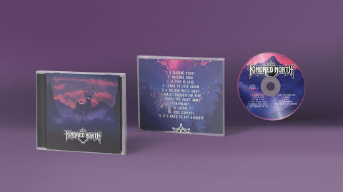
Music packaging in the melodic metal or atmospheric rock genres requires a strong visual identity that captures the epic, mysterious and moody essence of the sound. The objective was to design a comprehensive CD packaging suite for the self titled album "Kindred North" by Kindred North. The primary challenge lay in creating an immersive fantasy landscape that unifies the front cover, back track list and physical disc artwork. The layout needed to maintain a high contrast, mystical aesthetic while ensuring the stylised band logotype and a complex 11 song track list remained perfectly legible across small, physical print formats.
Our approach
We developed a cinematic, atmospheric design system that relies on a striking synth wave inspired colour palette and powerful wildlife symbolism.
The Front Cover Visuals The cover features a stark silhouette of a majestic stag standing on a rocky precipice, looking out over a mysterious mountain valley. This central subject is framed against a dramatic, glowing magenta sky filled with textured clouds, instantly establishing a sense of northern wilderness and mythic scale.
The Typography & Branding We implemented a custom, symmetry driven band logo for "Kindred North" featuring sharp, stylised letter forms and an integrated Nordic compass motif. This crisp white emblem anchors the bottom of the front cover and sits prominently on the physical disc, contrasting beautifully against the darker backgrounds.
The Layout Consistency The back cover and CD face extend the twilight mountain theme. The back jewel case liner organises the 11 tracks in a clean, vertical hierarchy using a custom, slightly distressed sans serif font that matches the album's energetic tone, while the physical disc mirrors the split magenta and deep purple gradients of the main horizon line.
The outcome
The final asset delivers a highly professional, cohesive physical CD package that functions as both a powerful marketing asset and a premium merchandise item for fans. The bold contrast between the luminous neon pinks and deep, nocturnal blues ensures the album commands attention on retail shelves and stands out vividly on digital streaming platforms. All design files were delivered as print ready templates with precise crop marks and bleeding guides, ensuring the rich colour gradients and sharp text lines replicate perfectly on standard jewel case inserts and high gloss on disc printing.
Related work
Liked the album cover design work for Kindred North?
Ready to begin a project?
Saint Nicolas is a design studio in Nuneaton, Warwickshire. Bespoke quote per project.