Vital Learning Business Stationery Design
This portfolio showcase highlights the corporate identity layout and print asset coordination for the Vital Learning Business Stationery. The objective was to design a vibrant, highly energetic, and professional corporate stationary that bridges educational growth with corporate vitality, instantly communicating progressive learning, structural development and a collaborative team culture.


Design & Requirements Breakdown
Visual Symbolism – The design features a dynamic, abstract watermark motif of interlocking human figures stretching upward across the central white canvas of the letterhead and business card backing. A sweeping, multi layered wave graphic arches gracefully across the top margin, visually reinforcing human potential, structured personal growth, and fluid organisational movement.
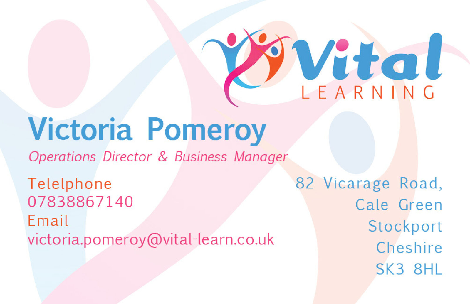
Typographic Architecture – A friendly yet clean sans-serif typeface spells out the company name "Vital LEARNING" beside a stylised corporate emblem depicting an active figure. On the executive business card layout, this typography maintains a highly precise alignment, cleanly balancing individual professional credentials such as the name "Victoria Pomeroy" with essential contact coordinates, keeping a lightweight information hierarchy optimised for effortless reading.
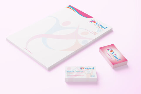
Premium Presentation – The stationery collection is showcased in a premium, 3D stacked print mock up composition resting on a soft, pastel tinted studio backdrop. This isometric perspective highlights a thick pad of official letterhead alongside two distinct stacks of business cards displaying both the vibrant, full bleed brand backing and the structured front facing contact details demonstrating a polished corporate suite optimised for educational consultation, training seminars, and official correspondence.
Strategic Colour Choice – A lively palette of magenta pink, bright cerulean blue, and soft pastel coral tones forms the energetic core brand accents, which are heavily contrasted by a crisp white paper canvas and delicate, muted watermarks. This uplifting, high contrast palette evokes immediate institutional trust, creative passion, and a modern, approachable identity suited for the education sector.
Target Audience Focus – The structured, people first layout is tailored to engage corporate HR professionals looking for reliable training partners, individual students seeking personal development programs, and business to business industry collaborators demanding a trustworthy, vibrant, and well established brand presence.