
Ultimate Babies And Children's Lullaby Time Cd Cover Design
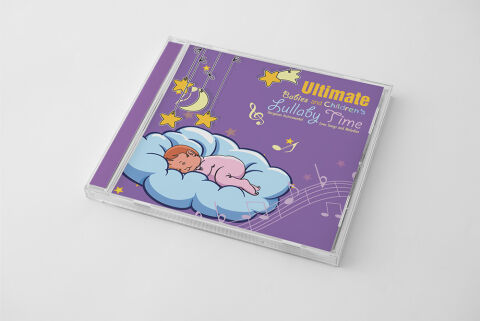
This portfolio showcase highlights the commercial print layout and graphic architecture for the Ultimate Babies and Children’s Lullaby Time CD Cover Design. The objective was to design a highly comforting, whimsical and enchanting album cover that bridges early childhood development media with premium retail packaging, instantly communicating serene auditory comfort, parental peace of mind, and a clear product identity for retail distribution.
Design & Requirements Breakdown
Visual Symbolism – The design features an adorable, stylised character illustration of a sleeping baby nestled safely inside a soft, fluffy blue cloud blanket as the primary visual anchor. This bedtime theme is beautifully layered into the graphic architecture via a hanging mobile arrangement displaying a smiling crescent moon and glowing yellow stars on the left canvas, while flowing, translucent white musical staves and notes sweep gracefully across the bottom right, visually reinforcing soothing audio melodies, absolute tranquility and a magical dreamscape journey.
Typographic Architecture – A playful, weighted sans-serif display typeface blocks out the primary brand name "Ultimate" in a vibrant, high visibility yellow in the upper right quadrant. Directly beneath, an elegant and fluid script font outlines the secondary title details, "Babies and Children’s Lullaby Time," in a crisp, clean white. The sub headings maintain a lightweight information hierarchy, neatly balancing descriptive genre taglines like "Bedtime Instrumentals, Love Songs and Rhymes" alongside an integrated vector treble clef symbol to keep the design highly legible for busy parents scanning retail displays.
Premium Presentation – The promotional artwork is presented inside a premium, high definition retail jewel case mock up perspective, showcasing the front booklet layout sitting behind a realistic clear plastic protective tray and dynamic edge borders. The composition captures realistic light reflections and subtle material drops across a clean, neutral white studio backdrop, offering a highly tactile and immersive preview of a completed physical media product ready for store shelving or digital audio marketplace storefronts.
Strategic Colour Choice – A sophisticated, sleep focused palette of deep lavender and soft violet forms the core brand signature background canvas, heavily punctuated by energetic pops of primary yellow for the focal stars and text elements. This distinct, high contrast palette evokes immediate domestic comfort, gentle nursery logic and a highly recognisable children's media brand identity that stands out beautifully against aggressive commercial competition.
Target Audience Focus – The structured, comfort first layout is tailored to engage parents and caregivers looking for effective sleep association tools, family members seeking a thoughtful, premium baby shower gift, and early childhood educators demanding high quality, transparently marketed calming auditory resources for classroom relaxation periods.