

Secrets By Stone Alibi Music Single Release Design
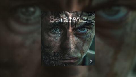
This portfolio showcase highlights the commercial print layout and graphic architecture for the Stone Alibi Secrets Music Single CD Cover Design. The objective was to design a highly atmospheric, intense, and emotionally raw album cover that bridges alternative rock, post grunge and dark indie musical heritage with premium physical and digital packaging, instantly communicating cinematic suspense, psychological depth and a striking product identity for retail distribution.
Design & Requirements Breakdown
Visual Symbolism – The design features a realistic, extreme close up photograph of a man's weathered face, streaked with dirt and glistening tears, serving as the powerful visual anchor. This intense and vulnerable human narrative is beautifully layered into the graphic architecture via harsh, directional key lighting that accentuates the subject's striking blue eyes and grim expression against deep, enveloping shadows. This visual layout seamlessly reinforces themes of hidden pain, betrayal, visceral emotional vulnerability and a deeply authentic, confessional rock narrative.
Typographic Architecture – A heavily weathered, textured sans-serif display typeface blocks out the track title "Secrets" across the upper left quadrant. The typography utilises custom transparency and masking effects, causing portions of the letters to organically dissolve into the subject's hair and skin textures. At the bottom right corner, a sleek, custom minimalist vector emblem represents the band's signature "Stone Alibi" logo in a clean white, maintaining a balanced information hierarchy optimized for effortless reading across streaming platforms or physical media displays.
Premium Presentation – The promotional artwork is presented in a high fidelity digital and print preview composition, framed beautifully against a dramatically scaled, heavily blurred background vignette of the central character's piercing eyes. This focused layout emphasises the sharp print resolution, intricate skin details, and intense shadow contrast of the central square cover art, offering a highly tactile and professional preview of a completed commercial music release ready for digital audio distribution or physical package manufacturing.
Strategic Colour Choice – A sophisticated, low key lighting palette of cold slate greys, deep charcoals, and muddy skin tones forms the core brand signature canvas, heavily punctuated by the stark white typography and the luminous blue of the subject's eyes. This distinct, de-saturated palette evokes immediate cinematic intrigue, alternative rock authenticity and a haunting visual identity that cuts through competing digital storefronts.
Target Audience Focus – The structured, concept first layout is tailored to engage dedicated rock and alternative music collectors looking for authentic physical or digital releases, fans of intense visual storytelling and retail music shoppers demanding a transparent, highly professional package design that beautifully honors the track's raw, emotional theme.