
Nail Gaga Gelore Label Design
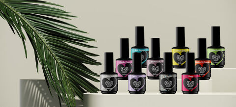
This portfolio showcase highlights the packaging design and multi shade label execution for Nail Gaga G'elore Gel Polish. The objective was to design a chic, high recognition bottle label system that establishes strong salon brand identity while enabling effortless shade identification across a diverse gel polish collection.
Design & Requirements Breakdown
Visual Symbolism – The design features a central, lace patterned heart emblem surrounding the "NG" brand monogram and "G'elore" script, anchored on dark opaque glass bottles. Each variant incorporates a colour matched neck band and heart background to visually reflect the specific gel shade inside such as Candy Town, Bon Voyage, Vanilla V' Orange, and Lippy.
Typographic Architecture – A clean, stylised sans-serif header presents shade names like "Black Velvet" and "Ballet Shoes" inside the upper curve of the heart frame, perfectly balanced by high contrast secondary text reading "Gel Color" for immediate salon drawer and display shelf readability.
Premium Presentation – The full wrap, gloss finish labels contour smoothly around compact 12ml UV/LED protected bottles topped with matte black caps. The tiered display layout demonstrates how the unified heart motif creates an organised, collectable salon line across dozens of colour formulas.
Strategic Colour Choice – Deep black and crisp white form a sophisticated baseline, offset by high contrast pastel and vibrant shade indicators of vivid fuchsia, sky blue, lemon yellow, lilac, and coral, to signal high pigment coverage, long lasting durability, and a fun, salon quality aesthetic.
Target Audience Focus – The stylish, shade first layout is tailored to engage professional nail technicians, salon owners, and nail art enthusiasts seeking durable, high shine UV/LED gel polishes with fast, intuitive colour selection.