

Untitled piece
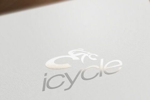
This portfolio showcase highlights the brand identity development for icycle. The objective was to design an ultra minimalist, sleek, and highly fluid emblem that captures the essence of motion, cutting edge bicycle engineering, and clean, active lifestyles.
Design & Requirements Breakdown
Visual Symbolism - The icon seamlessly blends a stylised cyclist silhouette leaning into motion with the smooth, curved contours of a bicycle frame, directly symbolising speed, flow, and human performance.
Typographic Architecture - A contemporary, lowercase sans-serif typeface gives the brand name a highly accessible, approachable, and tech focused look, echoing the fluid curves of the emblem above.
Premium Presentation - The digital mark transitions beautifully into physical media using premium blind embossing or silver foil, stamping the clean emblem onto textured, heavyweight paper stock to create an elegant, tactile experience.
Strategic Colour Choice - A pristine, monochromatic palette featuring metallic silver elements on an off white canvas is used to evoke crisp cleanliness, premium quality, and a modern, forward thinking aesthetic.
Target Audience Focus - The sophisticated, high end minimalist design is carefully tailored to attract passionate cycling enthusiasts, triathletes, and premium commuters who value meticulous craftsmanship and top tier cycling gear.