
Cleaner Signs Brochure Design
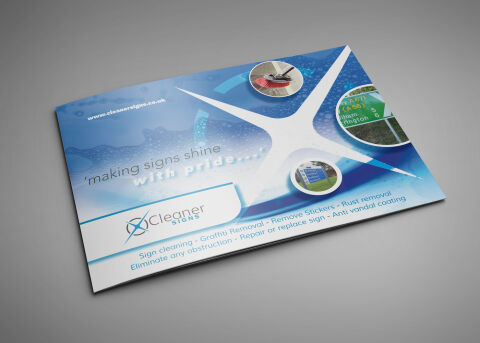
This portfolio showcase highlights the editorial brochure and marketing layout design for the Cleaner Signs Professional Service Guide. The objective was to design a clean, highly authoritative, and benefit driven corporate brochure that bridges industrial outdoor maintenance with commercial property care, instantly communicating commercial sign restoration, specialised cleaning capabilities and infrastructure maintenance to municipal and commercial clients.
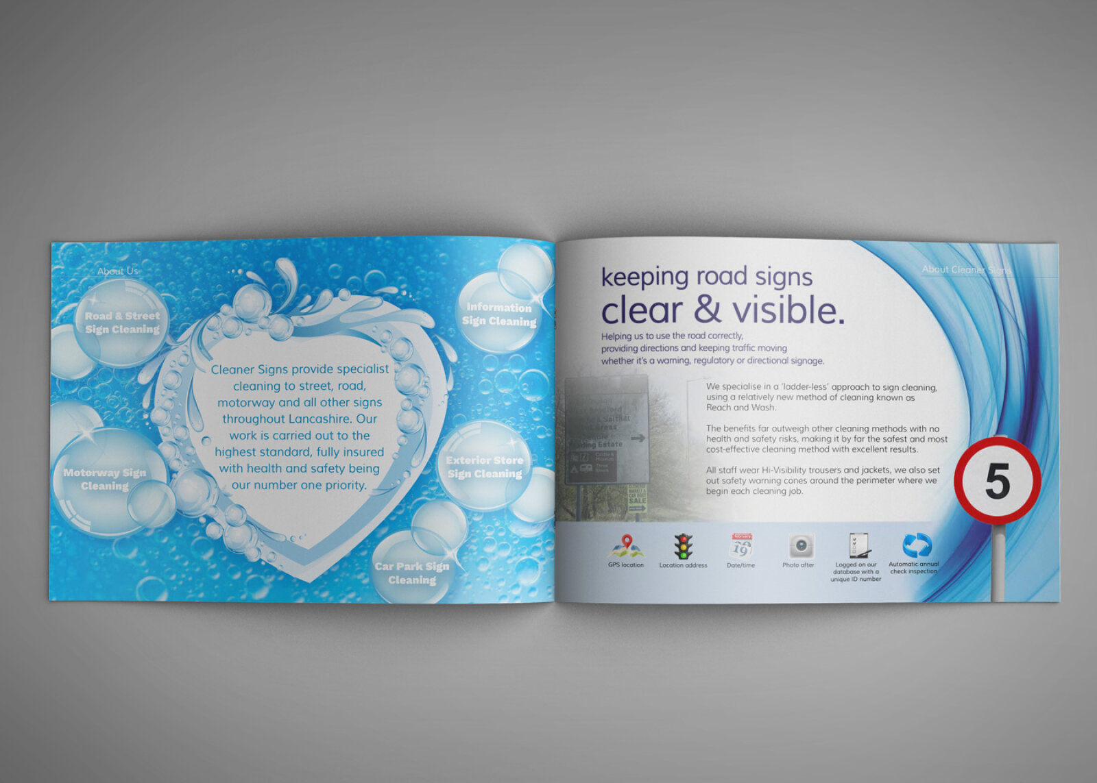
Design & Requirements Breakdown
Visual Symbolism – The design features a massive, ultra bright four point star graphic bursting across a dynamic blue backdrop, serving as an immediate visual metaphor for a pristine, gleaming finish. This central graphic is flanked by three distinct circular "before and after" application snapshots showcasing high pressure scrubbing machinery, green highway signs, and commercial storefront boards to visually reinforce absolute restoration precision, anti-vandal defense and heavy duty infrastructure preservation.
Typographic Architecture – A clean, modern sans-serif typeface delivers the core tagline ("making signs shine with pride...") with approachable professional authority. This is perfectly balanced by a highly legible, blue linear banner along the footer that acts as a structured service directory— clearly categorising core capabilities like Sign cleaning, Graffiti Removal, Remove Stickers, Rust removal and Anti-vandal coating for instant client navigation.
Premium Presentation – The landscape format marketing brochure is presented in a high end, matte finish print mockup perspective. This corporate framing highlights the clean edge trims, balanced margin proportions, and full bleed graphic flows, demonstrating a polished, professional document design optimised for B2B sales presentations, direct mail marketing campaigns and facility manager onboarding.
Strategic Colour Choice – A vibrant palette of high refraction aquatic blues, cyan gradients, and soft white canvas blocking is paired with crisp white typography to evoke sparkling cleanliness, deep water pressure activation and an ultra reliable, professional maintenance identity.
Target Audience Focus – The structured, service first layout is tailored to engage corporate facility managers looking to protect brand signage, municipal highways department procurement officers demanding compliant road sign visibility and commercial property owners seeking to restore street front curb appeal.