
Blackpool Property Buyers Property Valuation Flyer Design
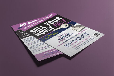
This portfolio showcase highlights the commercial print architecture and direct mail marketing layout for the Blackpool Property Buyers Property Valuation flyer design. The objective was to design a highly professional, high impact, and reassuring marketing flyer that bridges local real estate authority with clear, action oriented graphic design, instantly communicating rapid home buying reliability, financial relief, and structured business communication.
Design & Requirements Breakdown
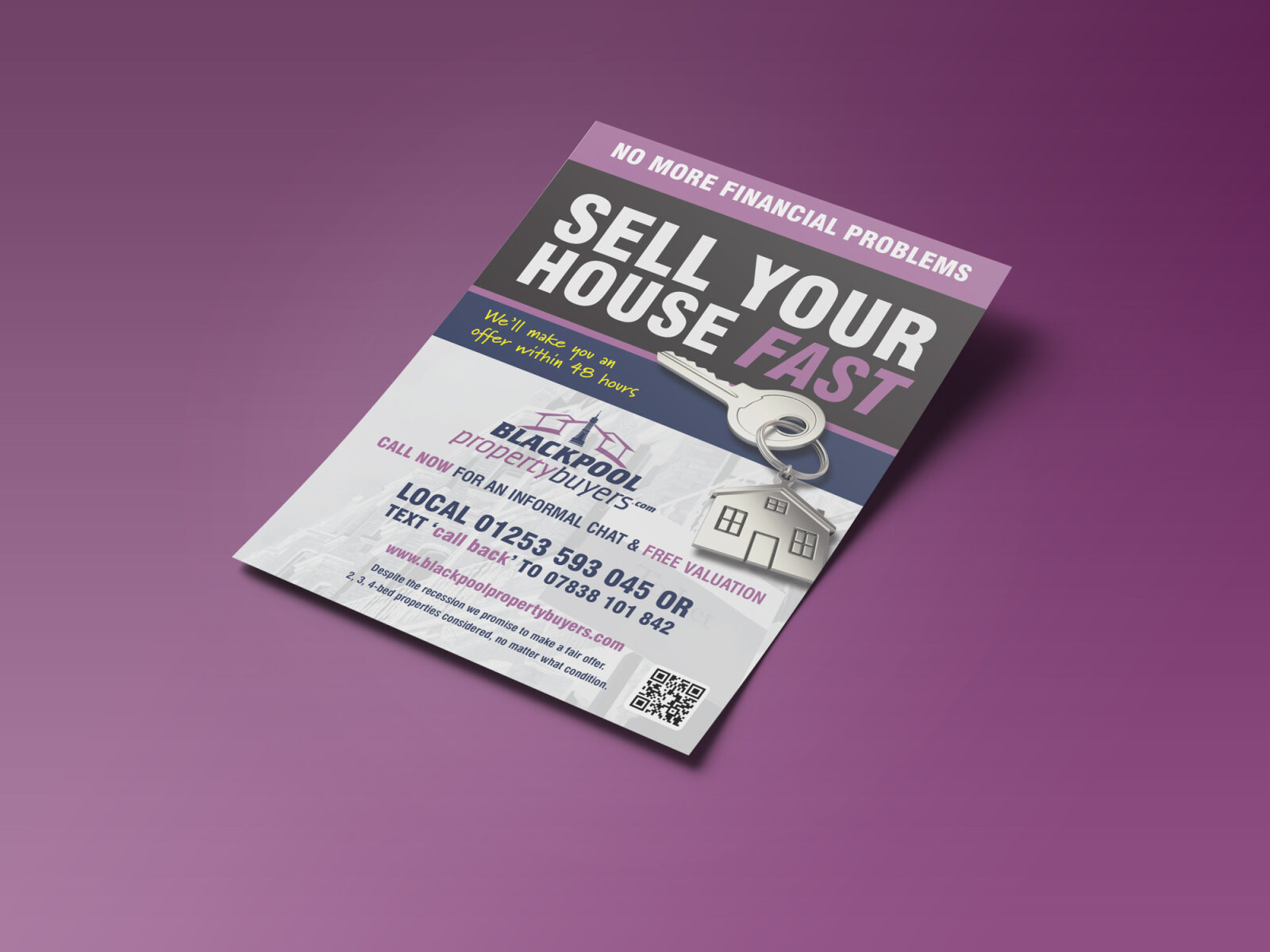
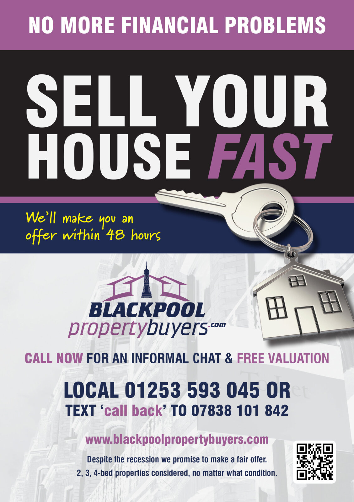
Visual Symbolism – The design features a realistic, high fidelity house key layered over a stylised line illustration of a modern home, dominating the upper right quadrant as the primary visual anchor. This real estate theme is beautifully anchored across the layout via a clean corporate logo displaying the "Blackpool Property Buyers" house and roof emblem, visually reinforcing immediate asset liquidity, property solutions, and corporate transparency.
Typographic Architecture – A bold, blocky sans-serif display typeface blocks out the primary headline "SELL YOUR HOUSE FAST" across the central angled black block, utilising a striking white and high visibility magenta colour hierarchy to maximise readability. Below the main message, a handwritten style script font delivers a personal promise of rapid valuation offers, while the lower white canvas utilises a clean, ultra legible sans-serif font to maintain a highly precise alignment for vital local telephone numbers, SMS text directions, and an official digital QR code block to keep a lightweight information hierarchy optimised for effortless reading.
Premium Presentation – The promotional collateral is presented in a premium 3D print mock up perspective showcasing a two page fanned arrangement with the front cover overlapping the reverse text canvas, resting at a dynamic angle on a deep plum studio backdrop. This composition emphasises mass print production quality, authentic edge definitions, and layout depth, offering a highly tactile preview of a complete direct mail marketing touch point.
Strategic Colour Choice – A sophisticated, professional palette of deep plum, vibrant magenta, and structured charcoal black forms the core brand signature background and headline blocks, heavily contrasted by a crisp white information canvas at the footer. This distinct, high contrast palette evokes immediate consumer trust, urgency logic and a highly recognisable local property brand identity that stands out in a crowded mailbox.
Target Audience Focus – The structured, solution first layout is tailored to engage distressed residential homeowners looking for immediate cash offers, property landlords seeking a rapid portfolio exit strategy, and local Blackpool residents demanding transparent, highly professional emergency real estate consultation.