

Better By Now By Heather Little Featuring The Whileaways Music Single Cover Design
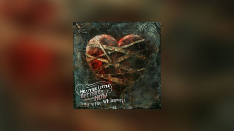
This portfolio showcase highlights the commercial print layout and graphic architecture for the Heather Little Better By Now (Featuring The Whileaways) Music Single CD Cover Design. The objective was to design a highly atmospheric, emotionally resonant, and rustic CD single cover that bridges roots, folk and Americana musical heritage with premium physical and digital packaging, instantly communicating raw emotional healing, textured depth and a striking product identity for retail distribution.
Design & Requirements Breakdown
Visual Symbolism – The design features a realistic, highly textured heart sculpture bound tightly by weathered, crisscrossing cloth bandages at the exact epicenter of the layout, serving as the core visual narrative. This evocative and intense theme of mending heartache is beautifully layered into the graphic architecture via an ornate, distressed Victorian style frame border with dark patina textures and oxidized copper undertones. This visual configuration seamlessly reinforces themes of resilience, vulnerable storytelling and a deeply authentic singer songwriter journey.
Typographic Architecture – A stylised, vintage inspired cursive serif font blocks out the artist’s name "Heather Little" inside an elegant, hand drawn vector ribbon banner in the lower left corner. Directly beneath, the track title "BETTER BY NOW" is rendered in a distressed, block display typeface, followed by a clean, elegant script font reading "Featuring The Whileaways." This deliberate typographic alignment keeps a lightweight information hierarchy optimised for effortless reading across streaming platforms or physical media displays while establishing a distinct, hand crafted branding signature.
Premium Presentation – The promotional artwork is presented in a high fidelity digital and print preview composition, framed beautifully against a warm, heavily blurred sepia and crimson studio backdrop. This focused vignette layout emphasises the sharp print resolution, intricate material details, and dramatic shadow casting of the central square cover art, offering a highly tactile and professional preview of a completed commercial music release ready for digital audio distribution or physical package manufacturing.
Strategic Colour Choice – A sophisticated, moody palette of deep teal greens, oxidized coppers, and rich crimson reds forms the core brand signature canvas, heavily contrasted by the warm cream tones of the typography banner. This distinct, antiqued colour palette evokes immediate cinematic intrigue, acoustic folk authenticity, and a mature visual identity that cuts through competing digital store fronts.
Target Audience Focus – The structured, concept first layout is tailored to engage dedicated Americana, folk and indie music collectors looking for authentic physical or digital releases, singer songwriter enthusiasts seeking immersive visual storytelling, and retail music shoppers demanding a transparent, highly professional package design that beautifully honors the track's raw, emotional theme.