
Yielding Property - Property Brochure Design
The challenge
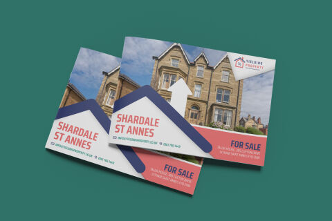
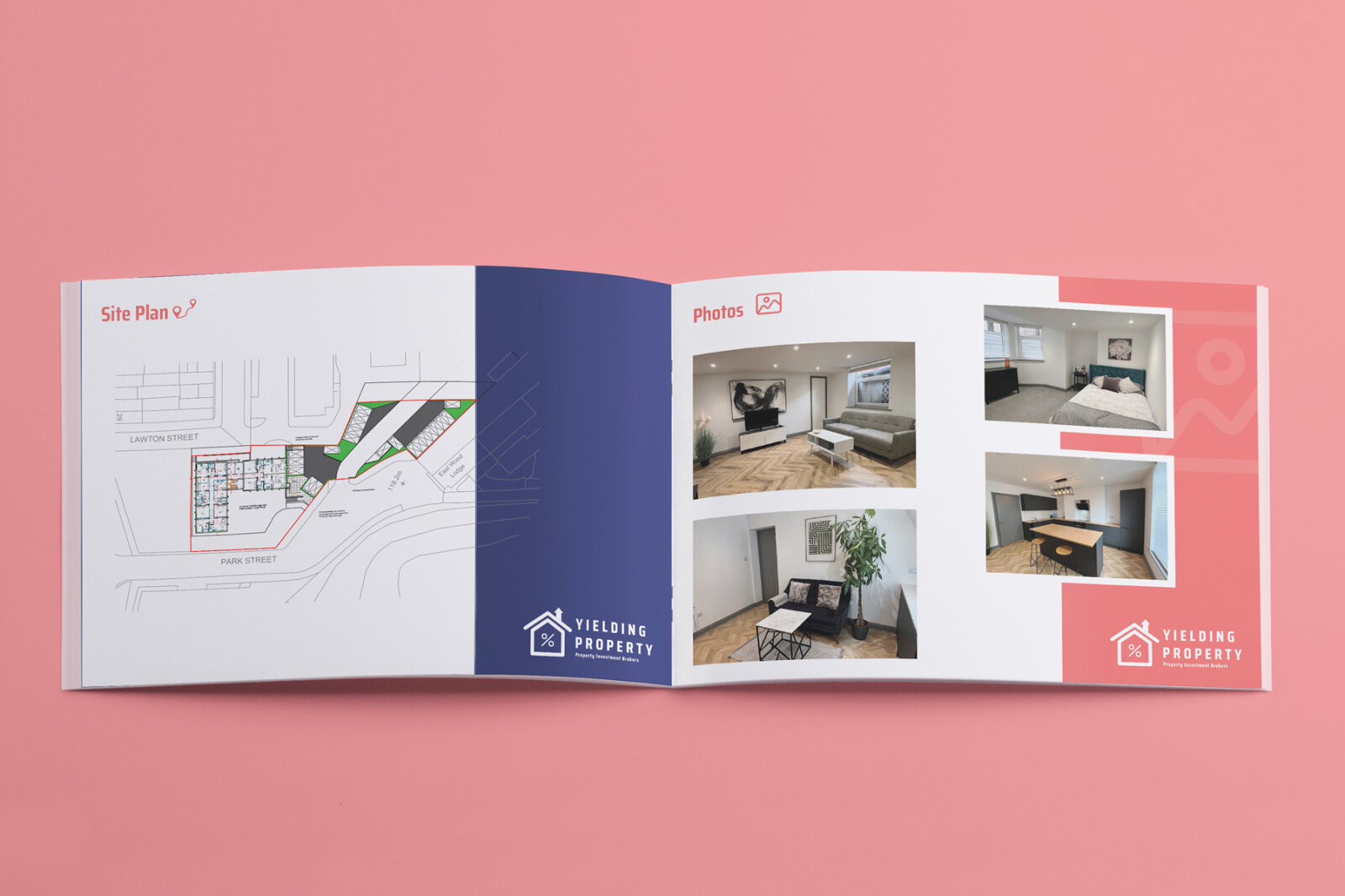
The residential real estate and property investment sector requires marketing materials that combine instant visual impact with structural clarity. The objective was to design a high conversion marketing flyer and property brochure for Yielding Property, focusing on the Shardale St Annes development. The primary challenge lay in creating a bold, memorable design layout that immediately communicates a "For Sale" status while neatly organising essential property details, address data and contact channels. The final asset needed to stand out in a competitive local market, appealing directly to potential buyers and property investors at a single glance.
Our approach
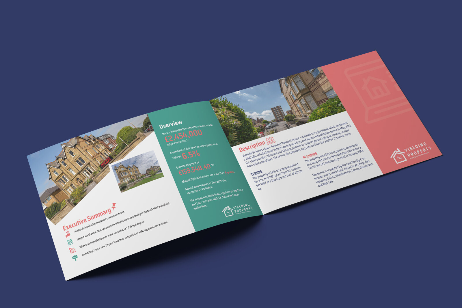
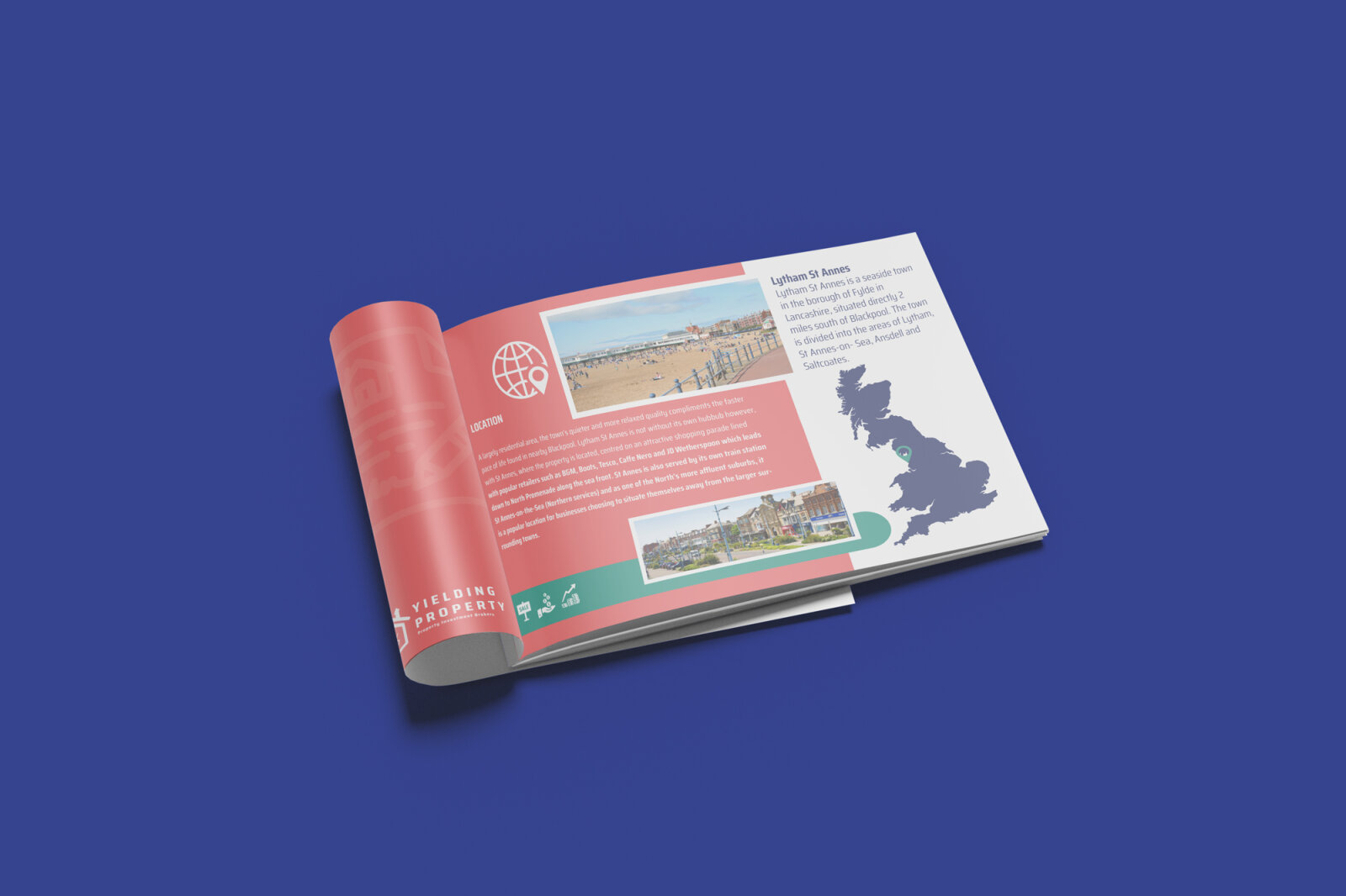
We developed a highly structured, theme driven design system that seamlessly integrates architectural photography with functional brand geometry.
The Visual Hook & Framing The layout is anchored by a large, high resolution photograph of the stone façade property set against a clear blue sky. We integrated a custom, oversized house shaped graphic overlay across the lower half of the frame. This bold blue and white icon wraps around the text, providing a literal and metaphorical connection to the housing market.
The Typography & Contrast We implemented a bold, clean sans serif typeface in a striking salmon pink tone for the primary title, "SHARDALE ST ANNES." This specific colour block is extended across the bottom right panel to house the prominent "FOR SALE" status and detailed property address, ensuring high contrast visibility against the white base.
The Strategic Details A vertical white arrow icon is embedded into the centre of the graphic, subtly symbolising growth, value, and upward investment potential. The upper right corner cleanly features the "Yielding Property" corporate logo, while the lower left edge aligns critical contact data, including the company email and phone number, next to functional digital icons.
The outcome
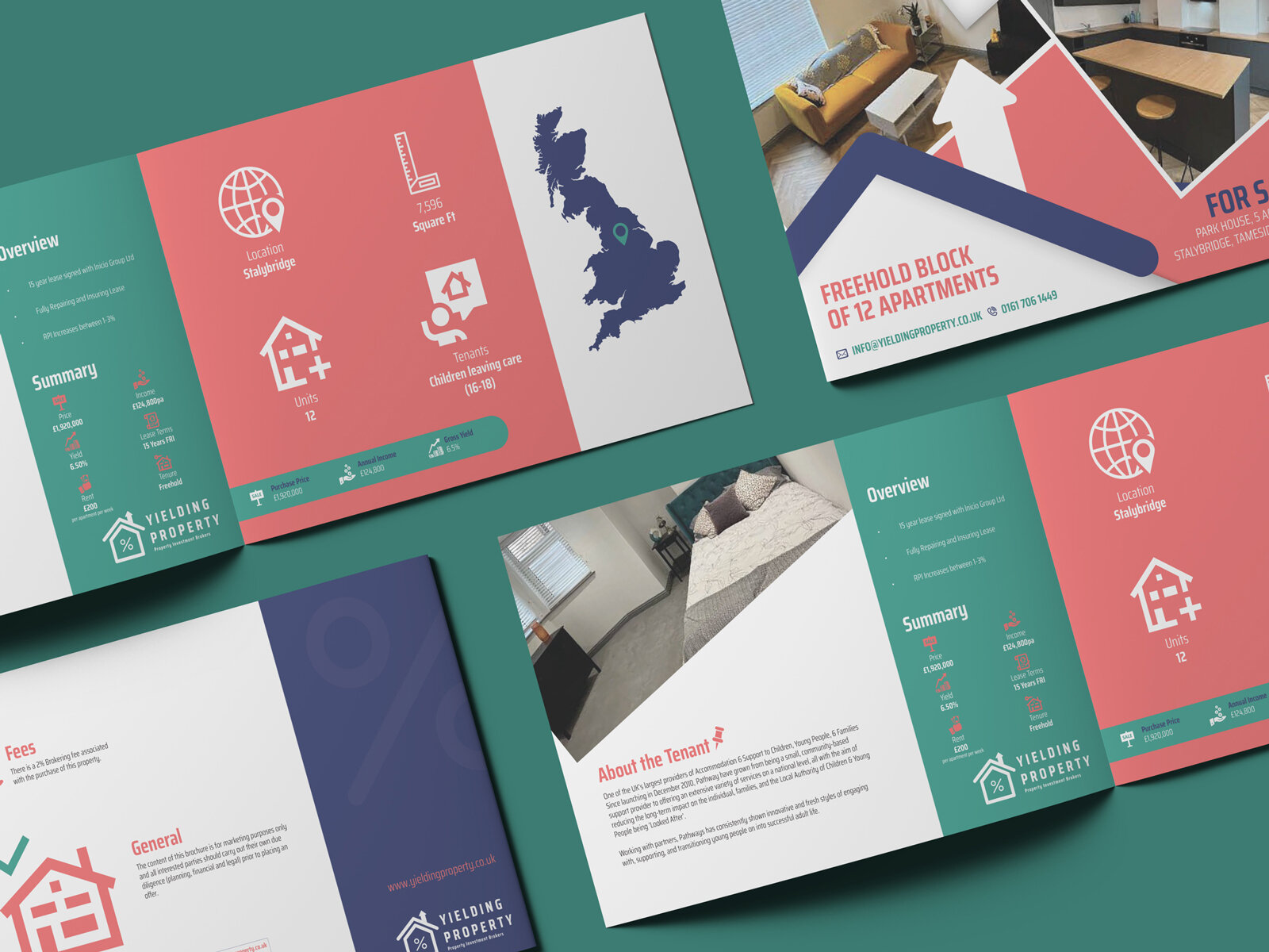
The final asset delivers a sharp, modern and highly recognisable property brochure that perfectly balances bold brand imagery with essential marketing data. The clever use of house shaped visual containers and high contrast color blocks gives the flyer an unmistakable presence, whether distributed as a physical handout in real estate offices or viewed digitally online. The print ready production files were delivered with optimised colour profiles, ensuring the deep navy blues, bright salmon pinks and fine stone work details replicate with crisp clarity on premium, semi gloss paper stock.
Related work
Liked the brochure design work for Yielding Property?
Ready to begin a project?
Saint Nicolas is a design studio in Nuneaton, Warwickshire. Bespoke quote per project.