
Brightside Farmstay Manual Brochure Design
The challenge
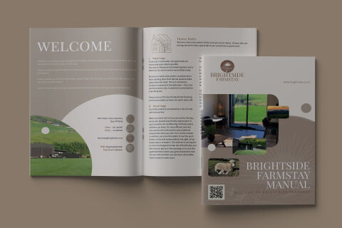
Hospitality branding and guest documentation require an identity that feels warm, inviting and highly informative. The objective was to design a comprehensive "Brightside Farmstay Manual" booklet for guests. The primary challenge lay in organising an expansive array of practical information including arrival checklists, house rules and local contact details into a structured layout that feels like a premium lifestyle magazine rather than a dry instructional sheet. The visual asset needed to instantly project the serene, rustic charm of the countryside while maintaining crisp legibility for guests of all ages.
Our approach
We developed a soft, organic design system that pairs fluid, modern shapes with a calming, nature inspired palette.
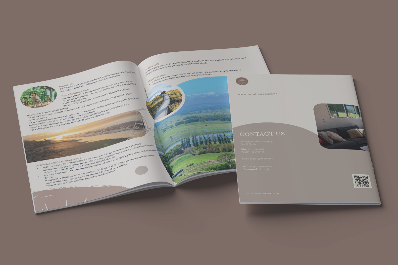
The Layout & Structure The brochure utilises smooth, sweeping arches and circular frame cut outs to house vibrant landscape and interior photography. This breaks away from rigid square grids, creating a gentle, welcoming visual rhythm that mirrors rolling hills and open countryside.
The Typography We implemented a elegant, high contrast serif font for major headings like "WELCOME" and "BRIGHTSIDE FARMSTAY MANUAL" to establish a sense of boutique luxury. For the body copy and technical bullet points, we paired it with a clean, highly legible sans serif typeface to ensure the house rules are clear at a glance.
The Palette & Detailing We curated a soothing palette of muted taupes, soft creams and natural sage greens, grounding the presentation in an organic, earthy aesthetic. Functional iconography is integrated into the welcome spread to neatly categorise essential contact information, while a custom QR code anchors the cover for instant digital access to guest resources.
The outcome
The final asset delivers a premium, highly cohesive guest orientation manual that beautifully elevates the hospitality unboxing experience. The balanced mix of elegant heritage typography, soft organic curves and practical information architecture positions Brightside Farmstay as a high end, thoughtful retreat. The templates were delivered as an optimised print ready package with specific bleed settings, ensuring the rich, earthy gradients and sharp text blocks reproduce flawlessly on physical, textured matte paper stock.
Related work
Liked the brochure design work for Brightside Farmstay?
Ready to begin a project?
Saint Nicolas is a design studio in Nuneaton, Warwickshire. Bespoke quote per project.