
The Oxfordshire Property Agent Branding Design
The challenge
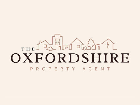
The real estate market demands a visual identity that conveys both high end premium prestige and local, community focused accessibility. The core objective was to design a brand identity for a property agent in Oxfordshire that reflects the region’s distinct architectural charm. The logo needed to feel established, elegant and trustworthy, avoiding generic corporate structures to appeal to premium property buyers and sellers alike.
Our approach
We designed a sophisticated solution bridging classic heritage typography with contemporary, minimalist illustration.
The Iconography A continuous line art skyline captures a curated mix of traditional cottages, rural homes and modern buildings, mirroring Oxfordshire's diverse property landscape.
The Typography
We paired an elegant, high contrast serif font for the main brand name to establish authority and luxury with a clean, widely tracked sans-serif subtext for modern balance.
The Colour Palette A warm, earthy palette of muted terracotta and deep espresso tones creates an inviting, premium and sophisticated aesthetic suited for high value properties.
The outcome
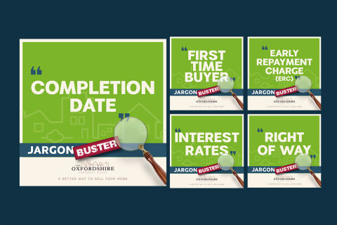
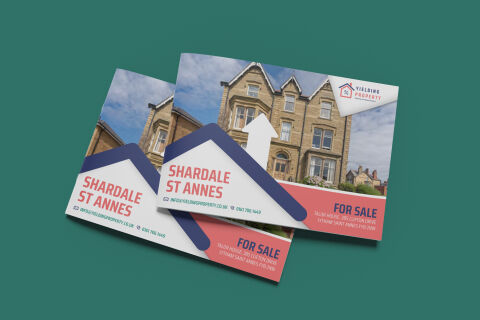
The final asset is an elegant, multi-layered brand identity that works beautifully across premium physical signage, property brochures, and digital listings. The balance of organic line work and classic typography positions the company as a premier local expert with high standards of curation. The client received a flexible design kit optimized for both luxury print collateral and online platforms.
Related work
Liked the logo design work for The Oxfordshire Property Agent?
Ready to begin a project?
Saint Nicolas is a design studio in Nuneaton, Warwickshire. Bespoke quote per project.