
Creed Nutrition Fitness Logo Design
The challenge
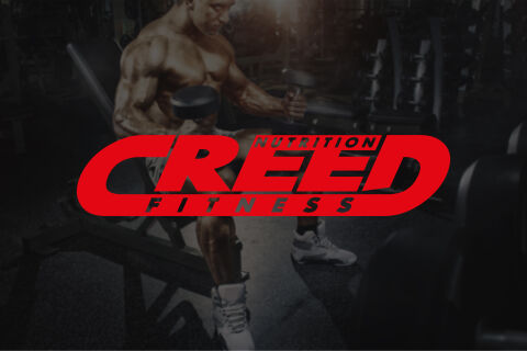
The sports nutrition and fitness market is heavily saturated with aggressive, chaotic branding that can quickly feel dated or look unpolished. The primary objective was to design a powerful corporate identity for Creed Nutrition Fitness that establishes a premium, authoritative presence in the industry. The design challenge lay in creating a dynamic, high energy logo system that conveys physical strength and momentum while remaining clean and highly scalable. The logo needed to retain its impact and structural clarity whether embroidered onto athletic clothing, stamped onto plastic supplement bottles or overlaid onto busy fitness imagery.
Our approach
We engineered a high velocity, geometric logo mark that uses forward slanting typography and bold colour contrast to simulate movement and power.
The Typography & Structure The primary word "CREED" is customised with an aggressive forward italic slant, symbolising speed, progression, and forward drive. The letters are bound within an extended capsule enclosure formed by the elongated strokes of the "C" and the "D," which locks the brand mark together into a highly cohesive, stamp like unit.
The Brand Subtext The secondary keywords "NUTRITION" and "FITNESS" are integrated into the negative spaces of the capsule frame. "NUTRITION" sits neatly tucked inside the upper curve, while "FITNESS" anchors the bottom frame in a bold, widely spaced sans serif font, creating a clear visual balance without crowding the central wordmark.
The Colour & Background Layering We utilised a high energy, vibrant red colour palette to instantly evoke passion, determination and intense physical output. For the portfolio presentation, this vivid red mark is placed over a dark, desaturated, high contrast photograph of a bodybuilder training in a gym, allowing the brand identity to pop as a powerful, unmistakable focal point.
The outcome
The final asset delivers a modern, high impact fitness brand identity that effortlessly commands attention across physical and digital spaces. The self contained capsule design gives Creed a highly versatile asset, serving as a functional standalone icon for social media profile stamps, apparel neck labels and gym signage. The client received a comprehensive, production ready branding package with optimised vector formats that scale perfectly from small web buttons to large scale retail storefront graphics.
Related work
Liked the logo design work for Creed Nutrition Fitness?
Ready to begin a project?
Saint Nicolas is a design studio in Nuneaton, Warwickshire. Bespoke quote per project.