
Elavate Collagen Green Superblend Packaging Design
The challenge
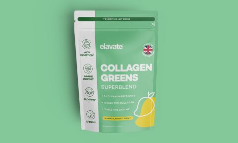
The wellness and green supplement market is increasingly crowded, with many brands relying on overly clinical, text heavy packaging. The objective was to design a flexible stand up pouch for elavate's Collagen Greens Superblend that feels clean, approachable and premium. The core challenge was to instantly communicate the product’s key health benefits and its specific mango flavour while maintaining a minimalist, uncluttered aesthetic that appeals to health conscious lifestyle consumers.
Our approach
We developed a refreshing, nature inspired visual identity that uses soft colour blocking and clean iconography to maximise shelf appeal.
The Color Palette We utilised a soothing, pastel green base to represent health and greens, paired with a vibrant pop of yellow for the mango flavour element, establishing an immediate sensory connection.
The Typography & Visuals A friendly, rounded sans-serif typeface was selected for the "Collagen Greens" title, accompanied by a minimalist line art illustration of a mango.
The Information Hierarchy We structured the layout to separate brand messaging from technical details, placing four clean, vertical benefit icons (Digestion, Immune, Bloating, Energy) down the left margin for effortless readability.
The outcome
The final pouch design presents a balanced, lifestyle oriented product that stands out against aggressive, gym focused supplements. The clean layout ensures consumers can instantly identify the product type, its primary flavour and its main health advantages in under two seconds. The design files were delivered as optimised print ready layouts with precise matte finishes in mind, ensuring the subtle pastel tones and white typography print with perfect clarity on eco-friendly pouch materials.
Related work

Liked the packaging design work for Elavate?
Ready to begin a project?
Saint Nicolas is a design studio in Nuneaton, Warwickshire. Bespoke quote per project.