
Trafford Oaks Flyer Design
The challenge
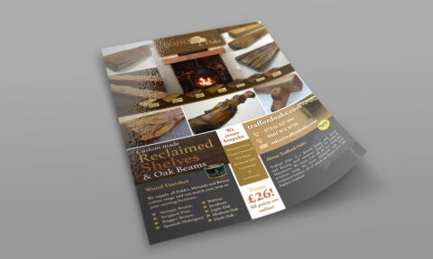
The primary obstacle was organising a large volume of dense product information including timber finishes, custom services, pricing and multiple contact details into a single A5 print flyer. The design needed to feel premium and showcase the high quality textures of rustic, handmade wood products without looking cluttered or overwhelming. It had to catch the eye instantly in local showrooms while functioning as an easy to read reference guide for customers.
Our approach
We developed a highly structured, grid based layout that balances rich imagery with clear informational blocks.
The Visuals A dynamic collage of high resolution product photography anchors the top half of the flyer, immediately showcasing the physical quality, grain variation and real world application of the oak beams and shelves.
The Typography We paired an elegant, traditional serif typeface for the main product headings to reflect a classic, rustic heritage with a highly legible sans-serif font for the technical finish lists and pricing details.
The Structure The bottom half utilises high-contrast colour blocks combining deep, earthy wood tones with warm gold accents to separate the product finishes list, company bio and a prominent call to action for the starting price point.
The outcome
The final print asset serves as an effective, high conversion marketing tool that seamlessly guides a reader from visual inspiration to critical purchase details. The flyer successfully elevates the brand's professional image while maintaining an approachable, local business feel. The print ready file was delivered with optimised colour profiles ensuring the rich wood textures and gold accents replicate perfectly on physical semi-gloss paper stock.
Related work
Liked the flyer design work for Trafford Oaks?
Ready to begin a project?
Saint Nicolas is a design studio in Nuneaton, Warwickshire. Bespoke quote per project.