
Wisdom Exploits Stationary Design
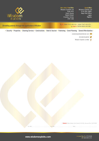
This portfolio showcase highlights the corporate identity layout and document architecture for the Wisdom Exploits Letterhead Design. The objective was to design a highly authoritative, structured, and prestigious corporate document that spans across diverse multi industry sectors, instantly communicating global enterprise growth, financial prosperity, and executive business reliability.
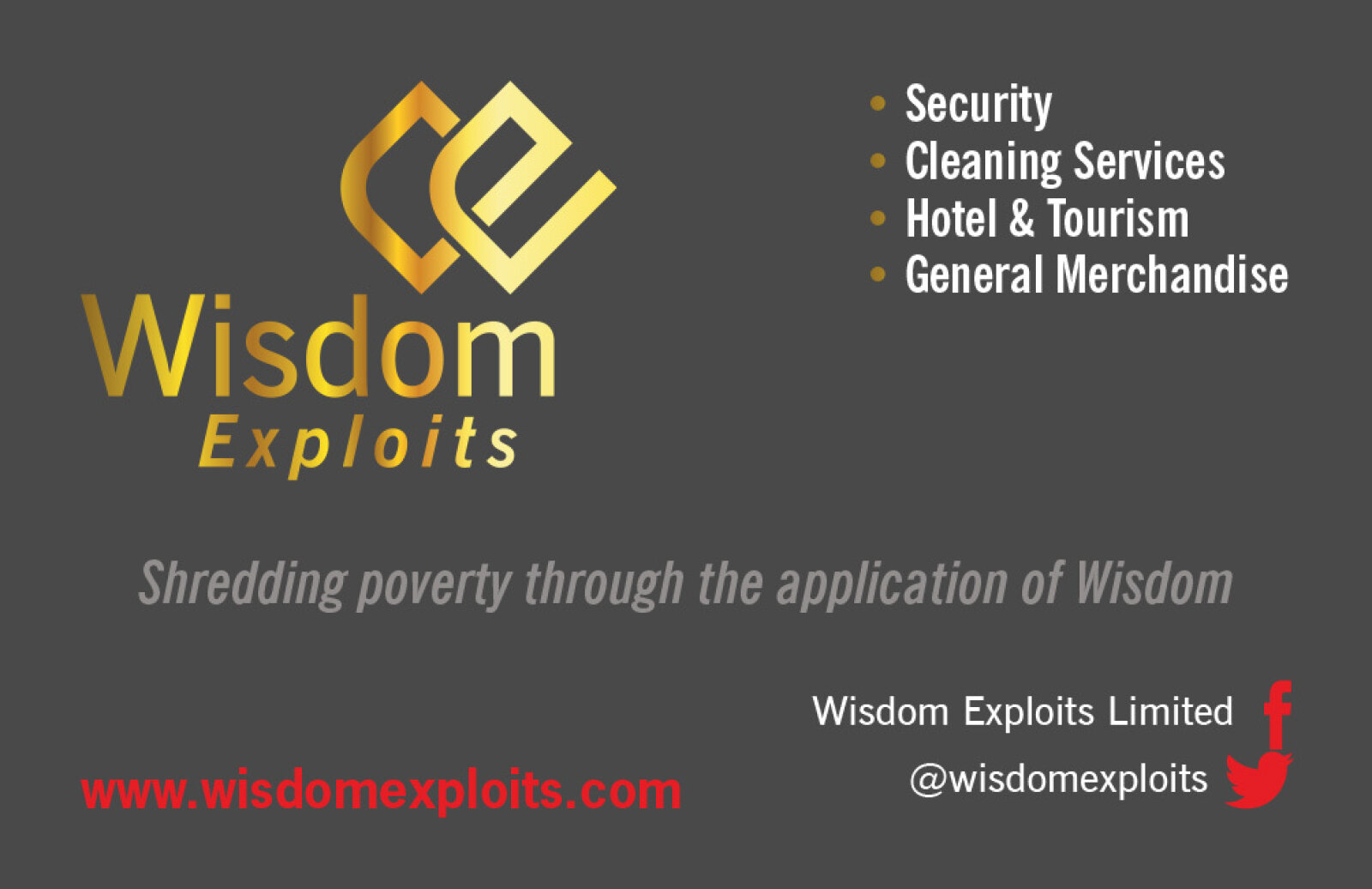
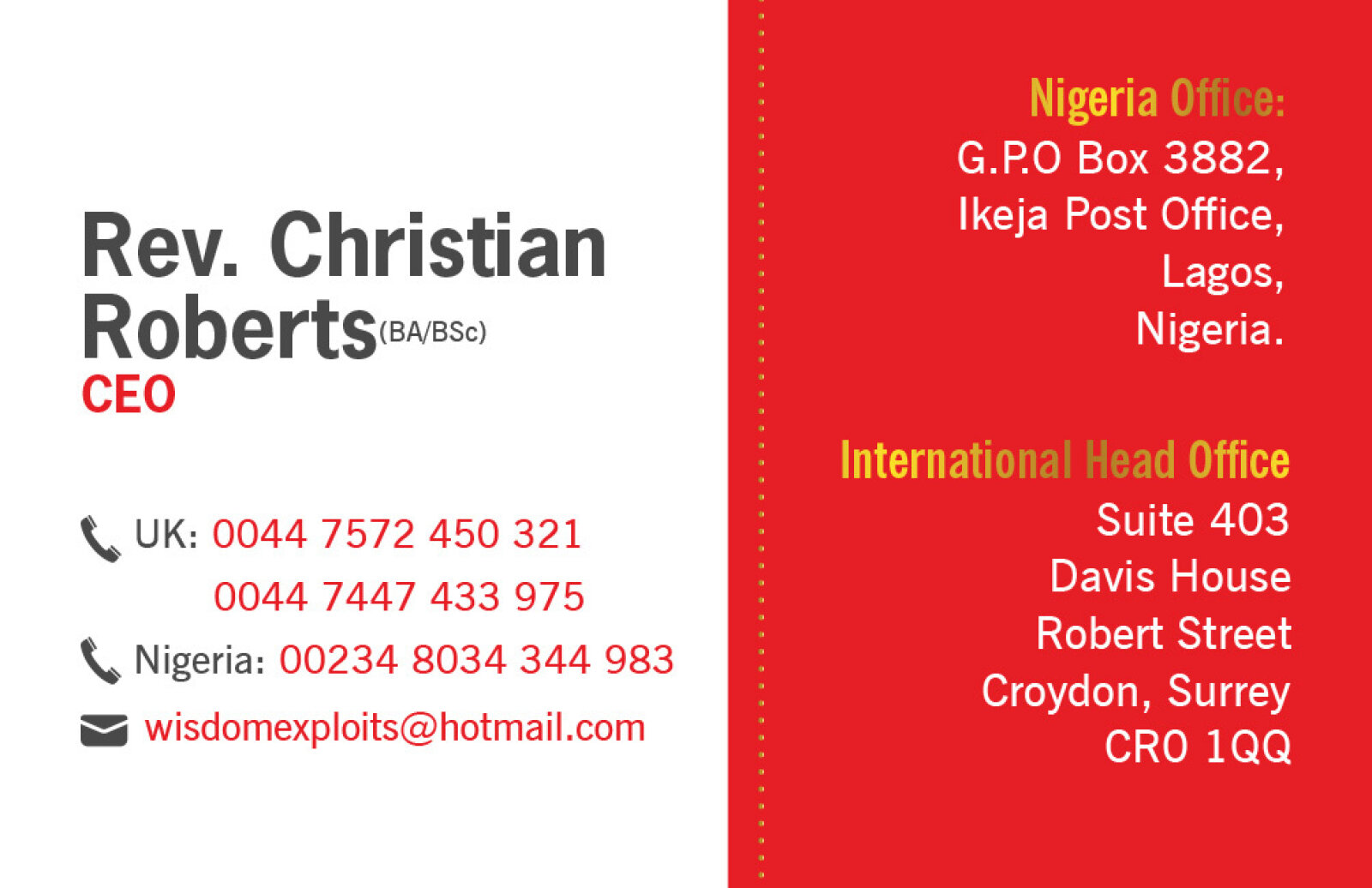
Design & Requirements Breakdown
Visual Symbolism – The design features a prominent, overlapping geometric monogram emblem composed of the letters "WE" that sits boldly in gold at the top left. This primary brand mark is beautifully echoed as a large, subtle, low opacity watermark matrix across the center of the white canvas. A metallic, gradient gold banner anchors the header section, visually reinforcing institutional wealth, premium market prestige, and strategic corporate structure.
Typographic Architecture – A clean sans-serif typeface organises the company name "Wisdom Exploits" with strong corporate weight. The layout features an immaculate, multi column contact directory across the charcoal header dividing international office coordinates in Surrey, UK, from local office details in Lagos, Nigeria. This is cleanly supported by a list of core business sectors (Security, Properties, Cleaning Services, Constructions, Hotel & Tourism, Publishing, Event Planning, General Merchandise) spanning horizontally beneath the gold focal line to establish a rigid and professional information hierarchy.
Premium Presentation – The corporate letterhead is presented in a crisp, high resolution portrait format. This structured presentation emphasises the balanced, full bleed header blocks, clear text padding margins, and a unified footer bar detailing the official web domain and company registration metrics, demonstrating a polished executive level document design optimised for international trade agreements, official b2b communications, and formal corporate billing.
Strategic Colour Choice – A sophisticated, executive palette of deep charcoal grey and a vibrant, polished gold metallic gradient forms the commanding background accents, which are heavily contrasted by a crisp white paper writing canvas and sharp white typography. This high contrast, prestigious colour scheme evokes immediate institutional trust, corporate stability, and a highly professional global identity.
Target Audience Focus – The structured, corporate first layout is tailored to engage international business partners looking for multi sector enterprise collaboration, high end commercial clients requiring certified corporate services, and institutional stakeholders demanding transparent, professional, and well established brand documentation.