Wirral Residential Buyers Brochure Design
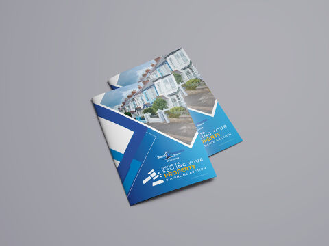
This portfolio showcase highlights the editorial brochure and marketing layout design for the White & Co / Wirral Residential Auctions: Guide to Selling Your Property Via Online Auction. The objective was to design a clean, highly strategic, and authoritative corporate document that bridges property marketing with fast paced digital auction mechanics, instantly communicating asset liquidation, regional real estate liquidity and professional transaction transparency to property sellers.
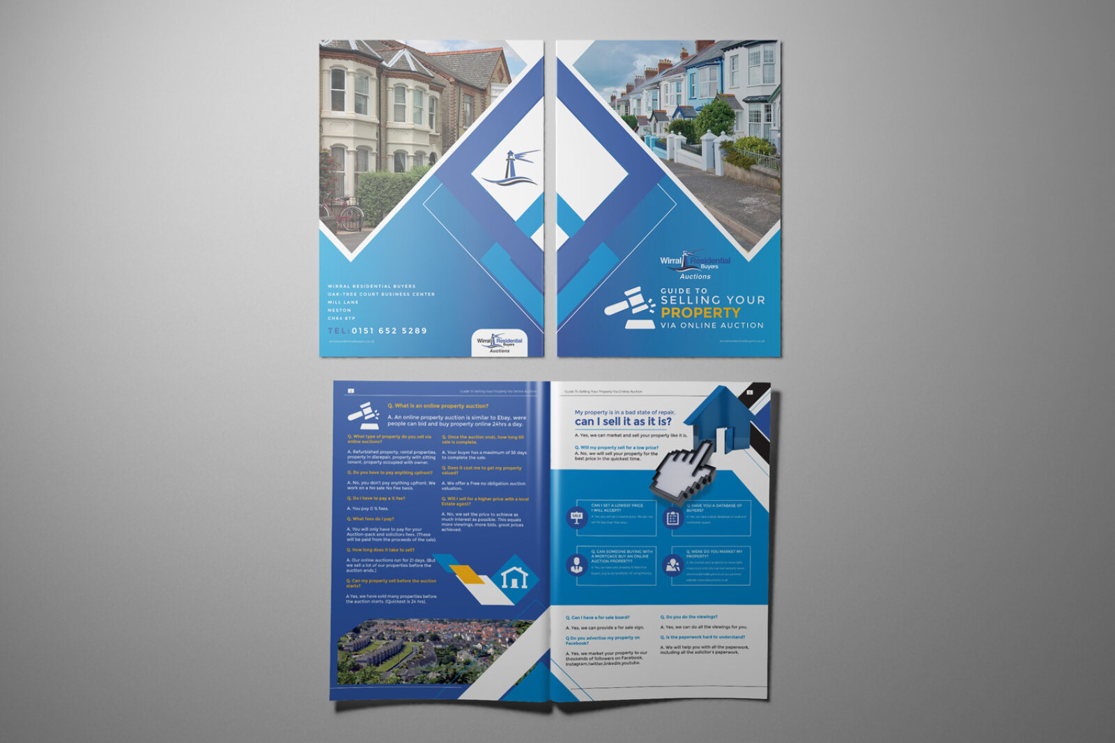
Design & Requirements Breakdown
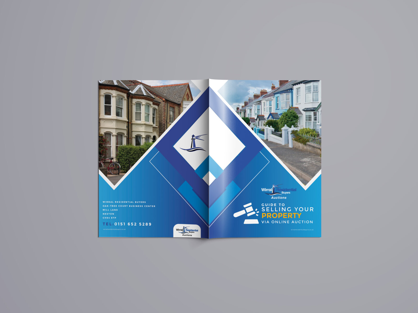
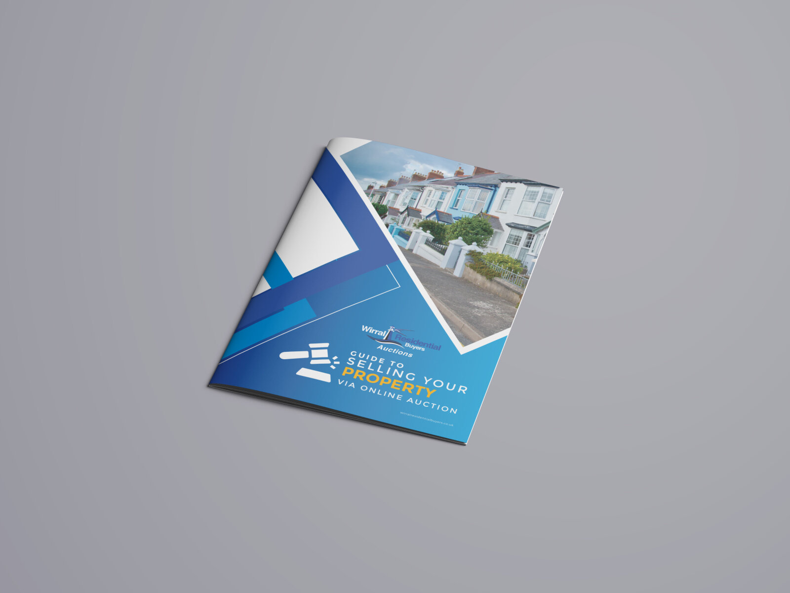
Visual Symbolism – The cover layout features an aggressive, interlocking geometric blue ribbon structure that forms a sharp, forward pointing chevron frame around a high resolution architectural photograph of suburban terraced housing. An integrated, clean white auction gavel and blocks icon sits prominently on the lower left, serving as an immediate visual shorthand for digital legal compliance, rapid bidding velocity and successful property sales.
Typographic Architecture – A clean, modern sans-serif typeface organises the core title structure ("GUIDE TO SELLING YOUR PROPERTY VIA ONLINE AUCTION") with maximum professional readability. This is perfectly balanced by high contrast yellow accent lettering for "SELLING YOUR PROPERTY" and a corporate brand signature for "White & Co / Wirral Residential Auctions" to deliver an immediate message of transactional security and local real estate expertise.
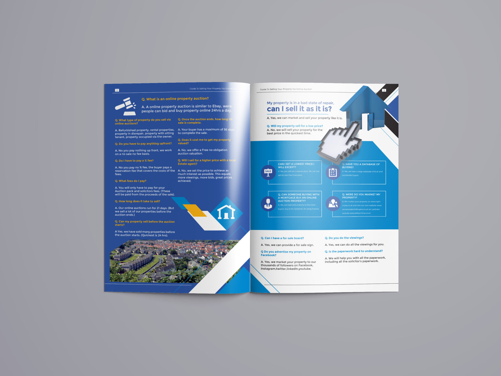
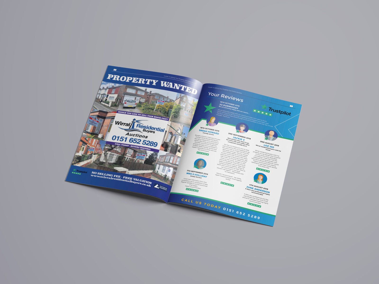
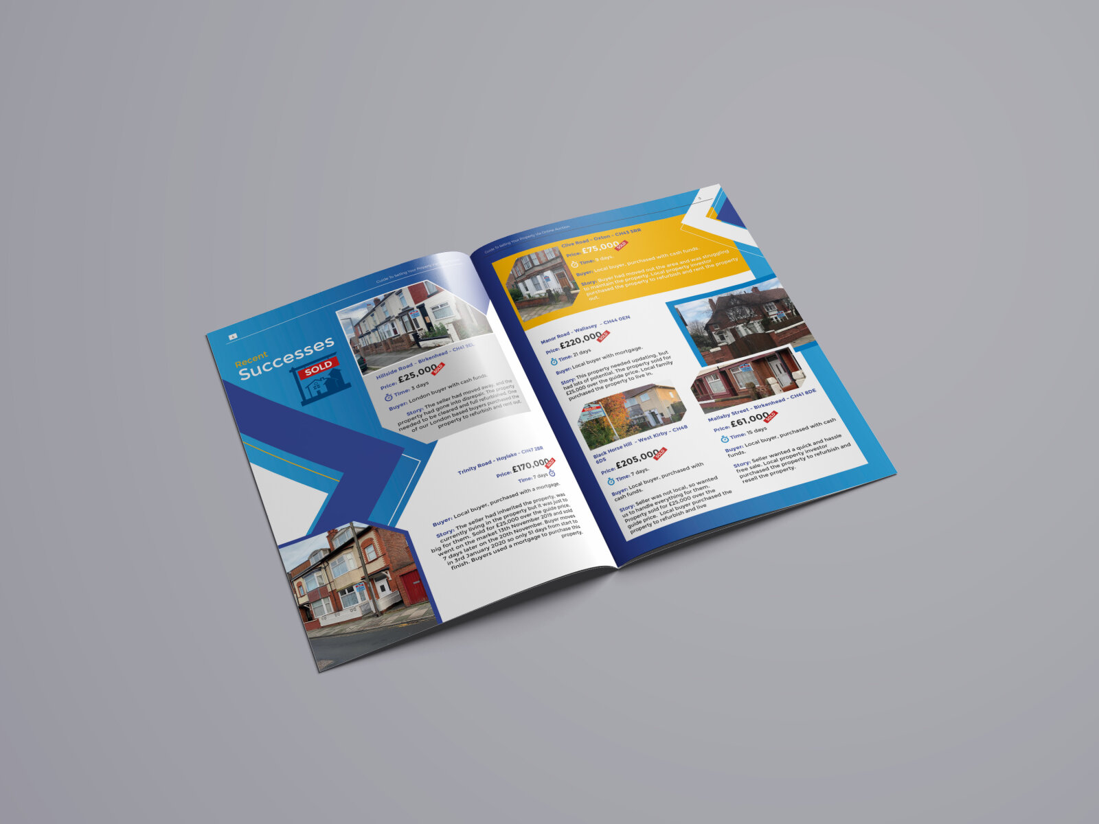
Premium Presentation – The portrait format marketing brochure is presented in a premium, matte finish stacked print mock up perspective against a neutral background. This clean framing emphasizes the precise page trim alignments, robust paper stock weight, and seamless full bleed graphic overlays, demonstrating a polished, executive level document design optimised for property appraisal meetings, client consultations and digital PDF distribution.
Strategic Colour Choice – A vibrant palette of high saturation corporate blues, geometric cyan gradients, and crisp white accent blocks is paired with energetic yellow typography to evoke legal trust, professional financial stability and an ultra modern, result driven real estate brand identity.
Target Audience Focus – The structured, service first layout is tailored to engage private homeowners looking for a fast and secure sale, estate executors seeking straightforward asset liquidation, and property investors demanding transparent, legally compliant online auction frameworks.