
Whs Supplements Capsules Bottle Design
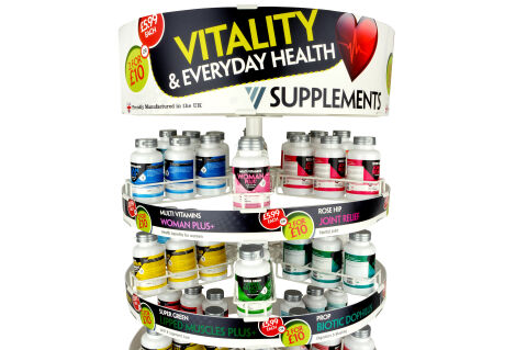
This portfolio showcase highlights the packaging design and retail display execution for WHS Supplements. The objective was to design a colour coded capsule bottle label range to match the tiered carousel display stand that maximises retail shelf impact, simplifies product selection across distinct health categories, and drives multi buy promotional value.
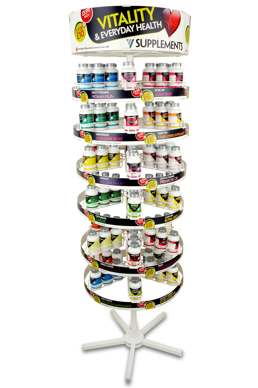
Design & Requirements Breakdown
Visual Symbolism – The design features a unified top header badge crowned by a pulsing anatomical heart icon alongside a bold Union Jack flag emblem, emphasising UK manufacturing origin and everyday cardiovascular vitality. A colour coded category system (pink for Woman Plus+, yellow for Super Green Lipped Muscles Plus+, green for Probiotic Dophilus, and red for Joint Relief) enables instant visual navigation across complex nutritional lines.
Typographic Architecture – A dominant, high visibility yellow and white sans-serif header commands primary attention with "VITALITY & EVERYDAY HEALTH," supported by structured, high contrast label copy that highlights specific product functions, active formulation call outs, and clear promotional pricing tags ("£5.99 EACH" and "2 FOR £10") for maximum retail readability.
Premium Presentation – The full wrap bottle labels feature metallic silver twist off caps arranged across a multi tier rotating wire counter display unit. The integrated header card and colour matched shelf strip banners create a complete 360-degree point of sale merchandising system optimised for pharmacy counters and high traffic retail environments.
Strategic Colour Choice – A clean off white base is paired with high visibility primary accents vivid magenta pink, bright canary yellow, emerald green, and rich crimson red whilst establishing a friendly, health conscious palette that signals clinical reliability, natural vitality, and immediate promotional value.