
Whs Sports Nutrition Stationary Design
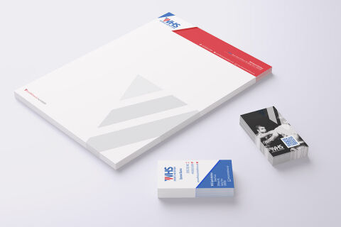
This portfolio showcase highlights the corporate document architecture and print asset layout for the WHS Sports Nutrition Stationery Design. The objective was to design a highly professional, clean, and dynamic corporate stationery set that bridges elite athletic performance with structured graphic design, instantly communicating manufacturing precision, nutritional reliability, and premium brand authority.
Design & Requirements Breakdown
Visual Symbolism – The design features a stylised, sharp geometric logo utilising dynamic red and blue arrows that crown the header as the primary brand mark. This energetic structure is echoed beautifully across the main letterhead canvas via a large, low opacity gray abstract pyramid watermark that anchors the lower central margins, visually reinforcing structured performance tiers, progressive growth, and corporate transparency.
Typographic Architecture – A bold, modern sans-serif typeface blocks out "WHS" in the primary logo, accompanied by a clean, geometric sub headline reading "SPORTS NUTRITION". Across both the letterhead and business cards, crisp sans-serif typefaces maintain a highly precise alignment, balancing essential corporate contact coordinates, physical address details, and digital links to keep a lightweight information hierarchy optimised for effortless reading.
Premium Presentation – The corporate stationery is presented in a premium 3D print mock up perspective resting at an angle on a soft, light tinted studio backdrop. This dynamic composition showcases a thick printed letterhead notepad with a solid red header band alongside dual sided business card stacks, beautifully displaying both a clean contact layout and a high impact monochrome photographic option embedded with a digital QR code link.
Strategic Colour Choice – A sophisticated, high energy palette of vivid crimson red and deep athletic blue forms the core brand signature and graphic blocks, heavily contrasted by a crisp white writing canvas and the soft, neutral grey watermark accents. This distinct, high contrast palette evokes immediate athletic trust, nutritional logic, and a clean, recognisable wholesale sports brand identity.
Target Audience Focus – The structured, corporate first layout is tailored to engage professional fitness athletes looking for elite nutritional supplementation, gym procurement managers seeking reliable brand partnerships, and health food distributors demanding transparent, highly professional business communication.