
When The Bombs Start Dropping By Cherry Hill Music Ep Cover Design

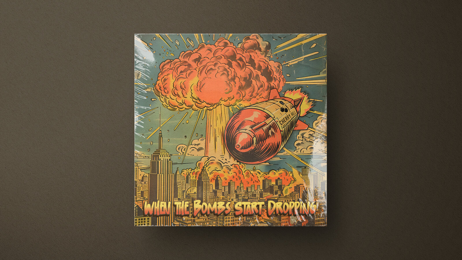
This portfolio showcase highlights the commercial print layout and graphic architecture for the Cherry Hill When The Bombs Start Dropping Music EP Cover Design. The objective was to design a highly atmospheric, visually explosive, and retro stylised album cover that bridges vintage comic book aesthetics with a dramatic, high stakes thematic narrative, instantly communicating a sense of cinematic urgency, counter culture energy, and a striking product identity for digital and physical distribution.
Design & Requirements Breakdown
Visual Symbolism – The design features a dramatic, multi layered pop art illustration at the exact epicenter of the layout, serving as the core visual narrative. A vintage, retro futuristic bomb bearing the "Cherry Hill" branding plunges toward a sprawling, detailed city scape anchored by an iconic Empire State style skyscraper. Looming in the background is a massive, stylised nuclear mushroom cloud exploding in vibrant, hand drawn comic line art, surrounded by dramatic action streaks. This evocative, intense imagery beautifully anchors the graphic architecture, seamlessly reinforcing the EP's underlying themes of sudden chaos, apocalyptic tension and a raw, high energy musical journey.
Typographic Architecture – The layout utilises a bold, high impact typography hierarchy positioned across the lower quadrant to anchor the release identity. The main title "WHEN THE BOMBS START DROPPING" is rendered in a prominent, distressed comic book style display typeface, featuring thick black outlines and an internal orange to yellow colour gradient that mirrors the explosions above. This deliberate typographic alignment keeps a balanced information hierarchy optimised for effortless reading on digital streaming thumbnails and streaming interfaces, while establishing a distinct, hand drawn branding signature that honors classic pulp and graphic novel aesthetics.
Premium Presentation – The promotional artwork is presented in a high fidelity digital preview composition, showcasing a square cover format with a tactile, aged newsprint and halftone texture overlay that mimics classic 20th century print media. The design utilises a close cropped framing layout to draw the viewer’s eye immediately from the falling bomb to the stylised title below. This focused presentation layout emphasises the sharp digital resolution, intricate line work details, and retro paper grain textures, offering a highly tactile and professional preview of a completed commercial music release ready for digital audio distribution.
Strategic Colour Choice – A sophisticated, retro inspired palette of fiery oranges, brilliant yellows, and aged cream tones forms the core brand signature canvas, creating an intense, cinematic atmosphere. This fiery, dramatic base is heavily balanced by a muted, de-saturated teal and slate blue sky background. This distinct, high contrast colour configuration injects an immediate sense of heat, nostalgia, and narrative gravity, ensuring the artwork cuts through competing digital storefronts and social media grids.
Target Audience Focus – The structured, concept first layout is meticulously tailored to engage dedicated collectors of indie, alternative, and punk rock physical or digital releases, pop art and graphic novel enthusiasts who appreciate narrative focused visual art, and music consumers demanding a transparent, highly professional package design that beautifully honors the track's raw, impactful, and retro themes.