
What A Truckin Life Cd Cover Design
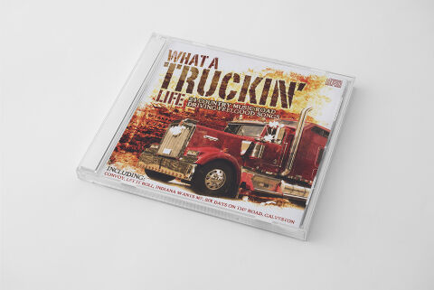
This portfolio design highlights the commercial print layout and graphic architecture for the "What A Truckin' Life: 24 Country Music Road Driving Feelgood Songs" compilation CD cover design. The objective was to design a highly atmospheric, rugged and visually striking album cover that embodies the freedom of the open highway. The layout instantly communicates a powerful and nostalgic driving rhythm, establishing a striking product identity optimised for physical retail distribution and digital music storefronts.
Design & Requirements Breakdown
Visual Symbolism - The design features a bold photographic composition of a classic, heavy-duty American semi-truck barreling down a rural road, serving as the core visual narrative. Flanked by sun drenched, golden brown trees along the wayside, the red truck grounds the compilation in the iconic lifestyle of long haul truckers and rural Americana. This evocative focal imagery seamlessly reinforces themes of the open highway, constant motion and the steady, rolling momentum of country driving anthems.
Typographic Architecture - The layout incorporates an elaborate, high contrast typography system designed to establish immediate shelf impact. The main title "WHAT A TRUCKIN' LIFE" dominates the upper half of the cover, rendered in a bold, heavily distressed Western style woodblock typeface with a weathered texture that echoes highway grit. Directly beneath it, the subtitle "24 Country Music Road Driving Feelgood Songs" is set in a clean, high legibility sans-serif font. At the very base of the design, a dedicated tracking footer clearly highlights notable included tracks, ensuring an effortless information hierarchy optimised for retail consumers.
Premium Presentation - The promotional artwork is presented in a high fidelity physical product mock up, showcasing the front cover precisely fitted into a pristine, clear crystal jewel case. The reflective edges and transparent plastic framing of the physical casing offer a highly professional, realistic boundary that enhances the rich tones of the print artwork. This focused layout highlights the sharp print resolution, clean boundary cuts and smooth colour grading, delivering a highly tactile and retail ready preview of a completed commercial release.
Strategic Colour Choice - A sophisticated, warm palette of deep crimson reds, rustic wood browns, and sun bleached ochre tones forms the primary photographic canvas, immediately evoking a nostalgic, daytime highway aesthetic. This earthy foundation is powerfully balanced by the bright, clean white tones used for the primary text elements and track listings, ensuring maximum legibility against the complex background. This distinct colour configuration injects an immediate sense of rugged energy, balancing traditional country grit with a polished visual tone that easily stands out across competitive store shelves.
Target Audience Focus - The structured, concept first layout is meticulously tailored to engage classic country and Americana enthusiasts, fans of traditional road trip tracks and audio collectors seeking high quality themed anthologies. The design satisfies retail music consumers demanding a transparent, highly professional package design that beautifully honors a high energy, classic country musical journey.