

West Lancs Auto Electrics Retail Ltd Auto Parts Flyer Design
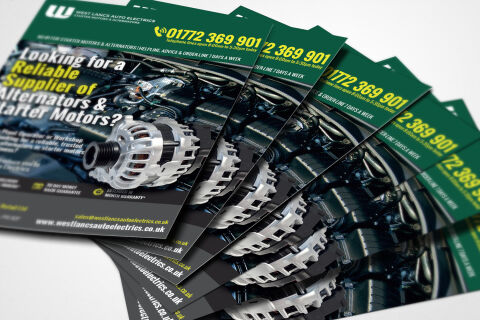
This portfolio showcase highlights the commercial print architecture and multi unit marketing layout for the West Lancs Auto Electrics Retail Ltd flyer design. The objective was to design a highly professional, striking, and rugged promotional flyer that bridges industrial automotive authority with clear, high impact marketing layout, instantly communicating component precision, trade reliability, and rapid telephone sales accessibility.
Design & Requirements Breakdown
Visual Symbolism – The design features a high fidelity, detailed photography backdrop showcasing an intricate vehicle engine bay, superimposed with a crisp, floating 3D render of a premium alternator component as the primary focal point. This mechanical theme is beautifully anchored across the layout via a clean corporate header displaying the "W" West Lancs Auto Electrics emblem, visually reinforcing technical engineering expertise, heavy duty parts supply, and corporate transparency.
Typographic Architecture – A bold, heavy sans-serif display typeface blocks out the direct headline inquiry "Looking for a Reliable Supplier of Alternators & Starter Motors?" across the upper left quadrant, utilising an alternating white and high visibility lime green colour hierarchy. Across the top and bottom margins, ultra legible, blocky fonts maintain a highly precise alignment, prioritising an oversized helpline contact number alongside essential web links and warranty guarantee icons to keep a lightweight information hierarchy optimised for effortless reading in busy workshops.
Premium Presentation – The promotional collateral is presented in a premium 3D print mock up perspective showcasing a fanned, overlapping stack of printed flyer sheets resting at a dynamic angle on a soft studio backdrop. This composition emphasizes mass print production quality, authentic edge definitions, and repetitive brand exposure, offering a highly tactile preview of a complete industrial trade counter touch point.
Strategic Colour Choice – A sophisticated, automotive first palette of deep British racing green and vibrant lime green forms the core brand signature header and text accents, heavily contrasted by a dark, metallic engine bay canvas and clean white information blocks. This distinct, high contrast palette evokes immediate mechanical trust, industrial logic, and a highly recognisable automotive trade brand identity that stands out on a busy workshop counter.
Target Audience Focus – The structured, product first layout is tailored to engage professional fleet operators looking for immediate commercial vehicle solutions, independent workshop mechanics seeking reliable component supply partnerships, and retail motorists demanding transparent, highly professional emergency or routine automotive electrical parts communication.