
Wash By Daniel Frank Music Single Cover Design
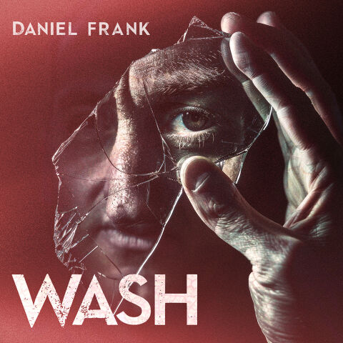
This portfolio showcase highlights the commercial print layout and graphic architecture for the Daniel Frank Wash Music Single Cover Design. The objective was to design a highly atmospheric, psychologically intense, and cinematic single cover that bridges alternative indie rock imagery with premium packaging, instantly communicating a sense of fractured identity, raw emotional introspection and a striking product identity for digital and physical distribution.
Design & Requirements Breakdown
Visual Symbolism – The design features a compelling, high contrast photographic portrait at the exact epicentre of the layout, serving as the core visual narrative. A hand holds a jagged shard of broken glass directly over a man's face, framing a piercing, hyper detailed eye that stares intently out at the viewer. This evocative theme of fractured reflection and self examination is beautifully layered into the graphic architecture by blending the texture of the shattered glass seamlessly with the dramatic, low key lighting on the subject's face. This visual configuration powerfully reinforces underlying themes of psychological tension, raw vulnerability, and an honest storytelling journey.
Typographic Architecture – A clean, modern sans-serif font blocks out the artist’s name "DANIEL FRANK" in the upper-left corner, maintaining a understated and professional footprint. Directly below, anchoring the base of the composition, the track title "WASH" is rendered in a large, bold display typeface featuring a distressed, cracked marble texture that directly mirrors the fractured glass motif above. This deliberate typographic alignment establishes a balanced information hierarchy optimised for effortless reading on digital streaming thumbnails and streaming interfaces while maintaining a distinct, high impact branding signature.
Premium Presentation – The promotional artwork is presented in a high fidelity digital preview composition, showcasing a square cover format with a tactile, fine grain photographic texture. The design utilises deep, dramatic drop shadows and a close cropped framing vignette to draw the viewer’s eye immediately to the centre focal point. This focused layout emphasises the sharp resolution, intricate material details and cinematic depth of the artwork, offering a highly professional preview of a completed commercial music release ready for digital audio distribution.
Strategic Colour Choice – A sophisticated, moody palette of deep crimson red, rich charcoal shadows, and cold, de-saturated skin tones forms the core brand signature canvas. The stark white of the typography provides a harsh, brilliant contrast that cuts through the darker, atmospheric background. This distinct colour palette evokes immediate cinematic intrigue, alternative rock authenticity and a mature visual identity that cuts through competing digital storefronts and social media grids.
Target Audience Focus – The structured, concept first layout is meticulously tailored to engage dedicated indie, alternative, and rock music listeners looking for authentic physical or digital releases, enthusiasts who appreciate dark, conceptual music iconography and retail music consumers demanding a transparent, highly professional package design that beautifully honors the track's raw, intense theme.