
Vrd We Are At War Cd Cover Design
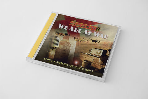
This portfolio design piece highlights the commercial print layout and graphic architecture for the We Are At War: Songs & Speeches of World War 2 Music Compilation CD Cover Design. The objective was to design a highly atmospheric, historically resonant and nostalgic CD cover that bridges vintage British heritage with premium physical packaging, instantly communicating wartime patriotism, dramatic historical weight and a striking product identity for retail distribution.

Design & Requirements Breakdown
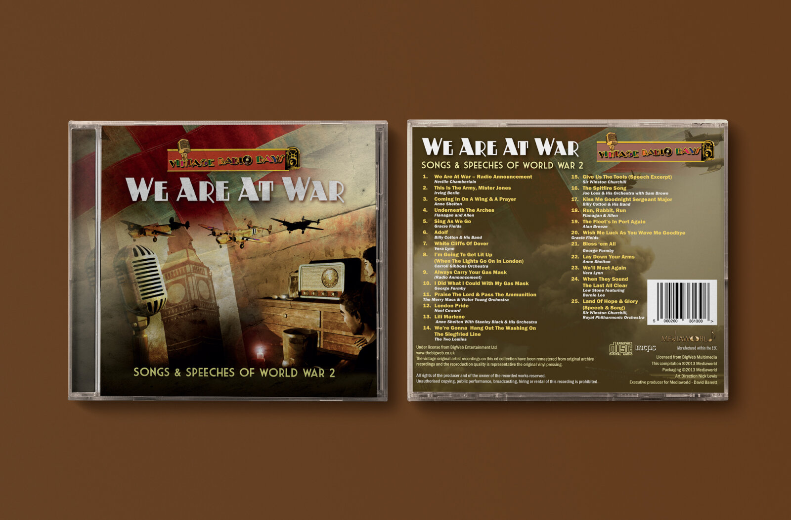
Visual Symbolism – The design features a multi layered digital collage of iconic 1940s imagery at the exact epicenter of the layout, serving as the core visual narrative. A vintage broadcast microphone and a classic tabletop radio set anchor the composition, symbolising the historic speeches and wartime broadcasts contained within the album. These media elements are beautifully layered into the graphic architecture alongside a looming silhouette of Big Ben and a squadron of military aircraft soaring across a distressed, sepia toned backdrop. This visual configuration seamlessly reinforces themes of resilience, historical remembrance and the collective home front experience of World War II.
Visual Symbolism – The design features a multi layered digital collage of iconic 1940s imagery at the exact epicenter of the layout, serving as the core visual narrative. A vintage broadcast microphone and a classic tabletop radio set anchor the composition, symbolising the historic speeches and wartime broadcasts contained within the album. These media elements are beautifully layered into the graphic architecture alongside a looming silhouette of Big Ben and a squadron of military aircraft soaring across a distressed, sepia toned backdrop. This visual configuration seamlessly reinforces themes of resilience, historical remembrance, and the collective home front experience of World War II.
Premium Presentation – The promotional artwork is presented in a high fidelity digital and print preview composition, showcasing the square jewel case booklet angled precisely against a crisp, neutral grey studio backdrop. This focused mock up layout emphasises the sharp print resolution, the clarity of the clear plastic casing and the vibrant yellow spine strip accent, offering a highly tactile and professional preview of a completed commercial music release ready for retail distribution or physical package manufacturing.
Strategic Colour Choice – A sophisticated, moody palette of sepia tones, aged paper textures, and deep charcoal shadows forms the core brand signature canvas, heavily punctuated by a bold crimson flag motif in the upper background. This distinct, antiqued colour palette evokes immediate historical intrigue, documentary authenticity, and a mature visual identity that cuts through competing historical and compilation album displays.
Target Audience Focus – The structured, concept first layout is tailored to engage dedicated history buffs, military memorabilia collectors looking for authentic physical releases, and vintage music enthusiasts seeking immersive audio storytelling. It captures the attention of retail music shoppers demanding a transparent, highly professional package design that beautifully honors the gravity and cultural heritage of the World War II era.