
Vrd Memories Are Made Of These Cd Cover Design
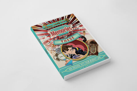
This portfolio artwork highlights the commercial print layout and graphic architecture for the Memories Are Made Of These: 100 Original Hits From Memory Lane CD Cover Design. The objective was to design a highly atmospheric, nostalgically resonant and visually dynamic album cover that bridges mid century retro kitsch with premium physical packaging, instantly communicating a sense of joyful nostalgia, timeless musical heritage and a striking product identity for retail distribution.
Design & Requirements Breakdown
Visual Symbolism – The design features a vibrant, multi layered digital collage anchored by a classic pop art illustration of a kissing couple enclosed within a circular focal frame, serving as the core visual narrative. Radiating from behind this central element is a bold, energetic sunburst pattern that infuses the graphic architecture with the optimistic spirit of the 1950s and 60s. This nostalgic landscape is beautifully layered with a montage of iconic vintage artifacts including a classic jukebox, a retro alarm clock and an old-fashioned microphone seamlessly reinforcing themes of romance, treasured milestones and a golden era of popular music.
Typographic Architecture – A stylised, vintage inspired dimensional script blocks out the main title word "Memories" across the upper center quadrant, nestled inside a distinct retro signage badge. Directly below, the connecting phrase "ARE MADE OF THESE" is split between a clean sans-serif font block and a curved teal banner accent. Across the lower quadrant, the descriptive subtitle "100 ORIGINAL HITS FROM MEMORY LANE" is rendered in a sharp, high contrast block display typeface. This deliberate typographic alignment creates a clear, layered information hierarchy optimised for maximum legibility across retail media shelves and digital storefronts, establishing an authentic period accurate branding signature.
Premium Presentation – The promotional artwork is presented in a high fidelity digital and print preview composition, against a clean, neutral grey studio backdrop. This focused mock up layout emphasizes the sharp print resolution, the structural depth of the premium CD format, and the continuity of the vibrant teal spine wrap, offering a highly tactile and professional preview of a completed commercial music release ready for manufacturing.
Strategic Colour Choice – A sophisticated, retro inspired palette of vibrant teal, cherry red, and warm cream tones forms the core brand signature canvas, heavily textured with a subtle vintage halftone print overlay. This distinct, high contrast colour palette evokes immediate mid century nostalgia, pop art authenticity and an energetic visual identity that cuts through competing multi disc compilation displays in physical and digital retail environments.
Target Audience Focus – The structured, concept first layout is tailored to engage dedicated collectors of vintage pop and rock and roll hits, nostalgia enthusiasts seeking comprehensive musical time capsules, and retail shoppers demanding a transparent, highly professional package design that beautifully honors the legendary artists and timeless memories of a classic generation.