
Vaporly Liquid Bottle Shot Label Design
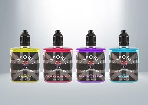
This portfolio showcase highlights the packaging design and flavour range label execution for Vaporly UK E-Liquids. The objective was to design a bold, modern, British heritage inspired label lineup that establishes high visual recognition on retail gantry shelves while clearly differentiating flavor profiles across a multi sku product range.
Design & Requirements Breakdown
Visual Symbolism – The design features a translucent Union Jack flag graphic across a dark metallic background, anchored by a central shield badge emblem. This visual structure blends iconic British manufacturing pride with vibrant, liquid matched colour blocking across each bottle to represent distinct flavour profiles like Vanilla Custard, Cherry Menthol, Blackcurrant Ice, and Berries Menthol.
Typographic Architecture – A stylised arch display header commands primary brand focus with "VAPORLY UK," complemented by classic scroll banner sub elements and high contrast, colour coded flavour labels along the bottom border for immediate consumer legibility on competitive retail shelves.
Premium Presentation – The full wrap, gloss laminated labels are customised for squat, flat profile shortfill bottles with precise nozzle caps, allowing the vibrant liquid colours and metallic background details to create a cohesive, collectable lineup when displayed side by side.
Strategic Colour Choice – A muted, dark slate gray Union Jack pattern provides a unified brand base across the range, offset by high octane flavour accents, bright canary yellow, vivid magenta, royal purple, and cyan blue, that correspond directly to the e-liquid profiles within.
Target Audience Focus – The distinctive, flavour first layout is tailored to engage adult vapers and retail shoppers seeking trusted UK crafted e-liquids, strong flavour profiles, and premium shortfill bottle aesthetics.