
Tweezers Beauty Salon Discount Promotion Flyer Design
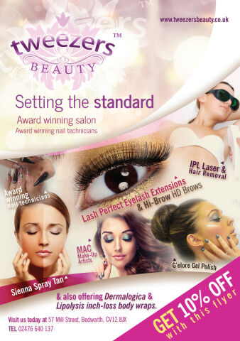
This portfolio showcase highlights the marketing layout and promotional print asset design for the Tweezers Beauty Salon Discount Promotion Flyer. The objective was to design a highly professional, glamorous, and inviting marketing flyer that bridges luxury aesthetic services with direct to consumer promotional design, instantly communicating salon authority, cosmetic precision, and an optimised customer acquisition funnel.
Design & Requirements Breakdown
Visual Symbolism – The design features a beautifully integrated collage of high resolution beauty treatments, dominated by a striking close up of flawless eyelash extensions and manicured nails as the central focal point. This aesthetic theme is elegantly reinforced by surrounding micro photography panels showcasing IPL laser therapy, makeup artistry and a flawless spray tan application. A fluid, sweeping white page curl dynamic cuts horizontally across the canvas, visually separating the upper branding zone from the service showcase below.
Typographic Architecture – A refined, flowing serif typeface blocks out the elegant "Tweezers BEAUTY" corporate logo crowning the upper left quadrant, accompanied by a clean, modern sans-serif statement reading "Setting the standard." Directly beneath this, authoritative text highlights the salon's award winning credentials. The lower canvas utilises a neat hierarchy of distinct sans-serif labels for specific treatment brands such as "Lash Perfect" and "Sienna Spray Tan" while the lower right margin features a bold, slanted bright yellow typography call out announcing an immediate "GET 10% OFF" incentive to optimise effortless reading and rapid customer conversion.
Premium Presentation – The promotional collateral is presented in a flat, high definition layout utilising structured, organic content masks to blend multiple photographic elements into a cohesive graphic canvas. This clean composition showcases a dedicated white footer strip at the base, which neatly blocks out essential physical location addresses, local landline contact coordinates, and the official brand web link to anchor the design framework.
Strategic Colour Choice – A sophisticated, beauty first palette of rich plum, vibrant magenta, and soft pastel pinks forms the core brand signature background and headline block accents, heavily contrasted by a crisp white canvas and the high visibility yellow discount banner. This distinct, high contrast palette evokes immediate consumer trust, cosmetic logic, and a clean, recognisable luxury salon identity that stands out in a retail display.
Target Audience Focus – The structured, service first layout is tailored to engage local residents looking for premium routine grooming, beauty conscious individuals seeking elite, award winning skin and nail enhancements, and new clients demanding transparent, highly professional aesthetic consultations that reward booking actions.