
The Wizard Of Recollection Book Design Cover
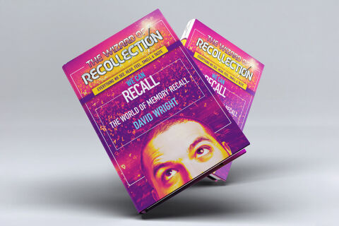
This portfolio showcase highlights the commercial cover illustration and print jacket layout for The Wizard of Recollection Book Design Cover. The objective was to design a highly professional, striking, and enigmatic book cover that bridges psychological non-fiction with vibrant editorial graphics, instantly communicating cognitive depth, memory mastery, and an engaging visual narrative that stands out on a physical or digital bookstore shelf.
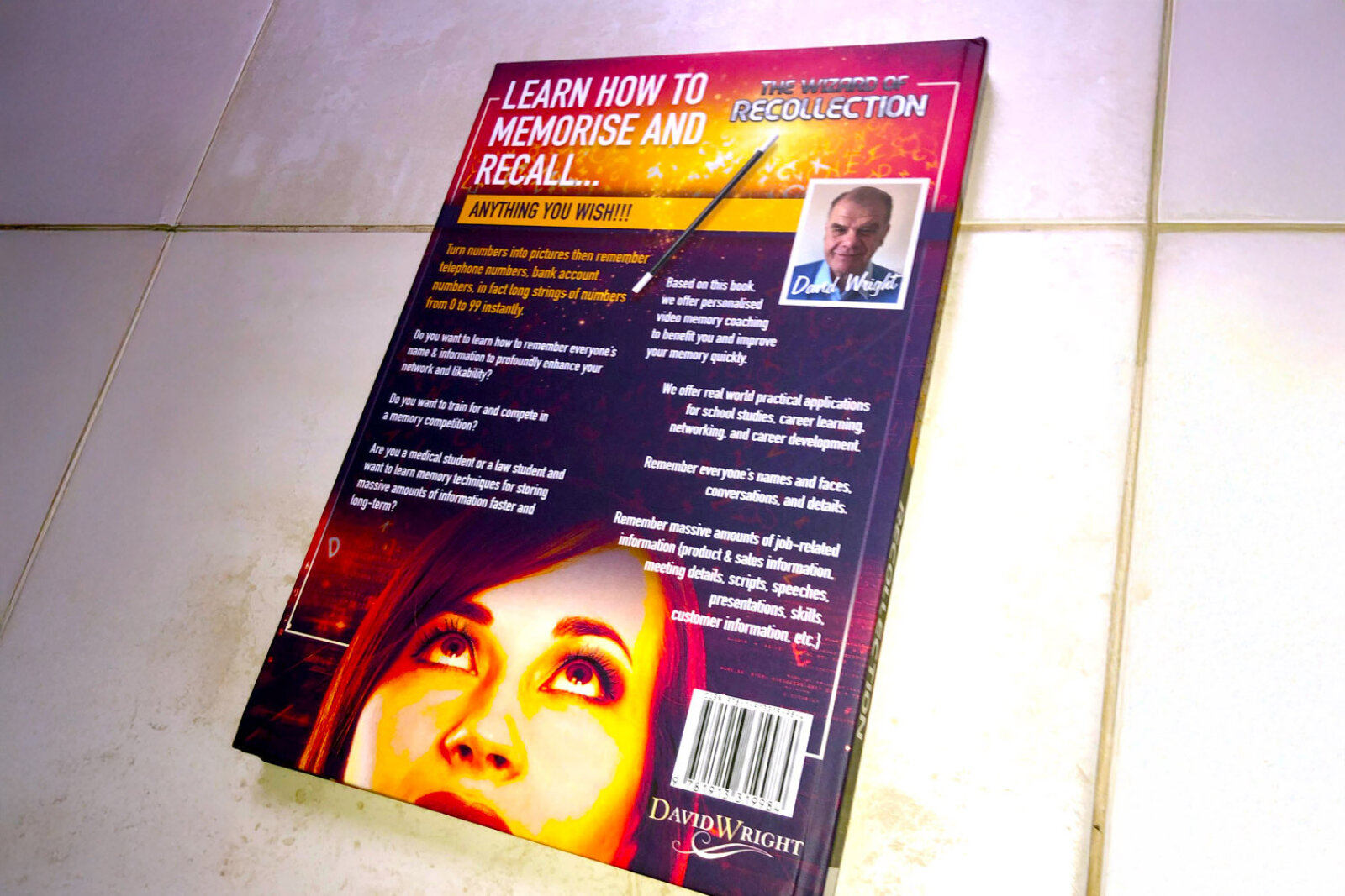
Design & Requirements Breakdown
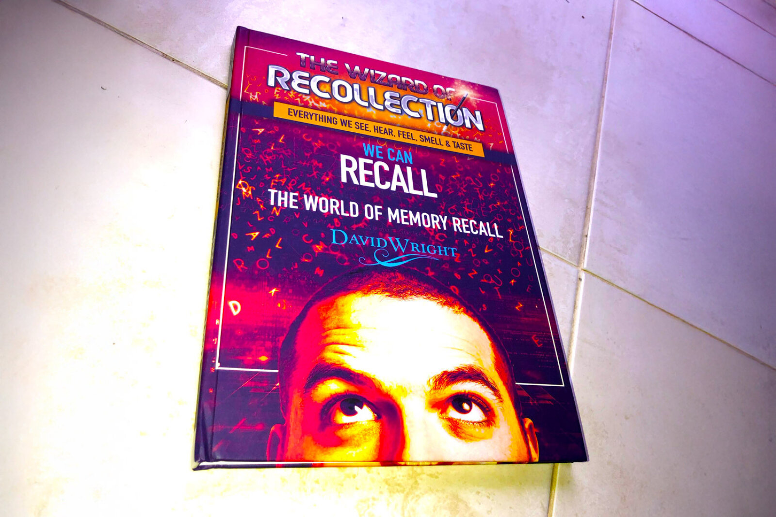
Visual Symbolism – The design features a stylised, high contrast photographic portrait of a man’s face peeking from the bottom margin, with eyes turned upward in deep contemplative thought. This psychological theme is beautifully layered into the graphic architecture via an immersive background grid covered in floating, low opacity typographic letter forms and binary fragments, visually reinforcing neural storage networks, memory recall processes and absolute cognitive complexity.
Typographic Architecture – A bold, marquee style sans-serif typeface blocks out the primary title "THE WIZARD OF RECOLLECTION" across a solid pink banner at the top, crowned by an integrated, glowing yellow lightning bolt symbol. Directly below this, a clean yellow accent strap states the core theme, "EVERYTHING WE SEE, HEAR, FEEL, SMELL & TASTE." In the central matrix, clean sans-serif typefaces precisely center the main sub-headings "WE CAN RECALL" and "THE WORLD OF MEMORY RECALL", balanced neatly above the author name "DAVID WRIGHT" to keep a lightweight information hierarchy optimised for effortless reading.
Premium Presentation – The promotional asset is presented in a premium 3D book mock up perspective showcasing two copies of the book resting at a dynamic angle on a neutral, soft grey studio backdrop. This composition emphasises mass print production quality, book spine depth, and realistic surface shadows, offering a highly tactile and immersive preview of a completed commercial editorial touch point.
Strategic Colour Choice – A sophisticated, mind bending palette of deep electric purple, vibrant magenta pink, and hot orange forms the core brand signature canvas, heavily punctuated by energetic pops of primary yellow for the focal text elements. This distinct, high impact palette evokes immediate psychological curiosity, cognitive logic, and an easily recognisable literary identity that commands attention from passing readers.
Target Audience Focus – The structured, concept first layout is tailored to engage everyday readers looking to expand their personal memory capabilities, students seeking advanced study retention techniques, and psychology enthusiasts demanding an engaging, transparent, and authoritative exploration of human memory networks.