
The Piles High Club By Chief Keegan Music album Cover Design
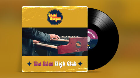
This portfolio showcase highlights the commercial print layout, vinyl record presentation, and graphic architecture for the Chief Keegan The Piles High Club Music Album Cover Design. The objective was to design a highly retro, soulful, and funk inspired album design that bridges classic 1970s vinyl aesthetics with a modern retail release, instantly communicating analog performance authenticity, rhythmic groove and a clear product identity.
Design & Requirements Breakdown
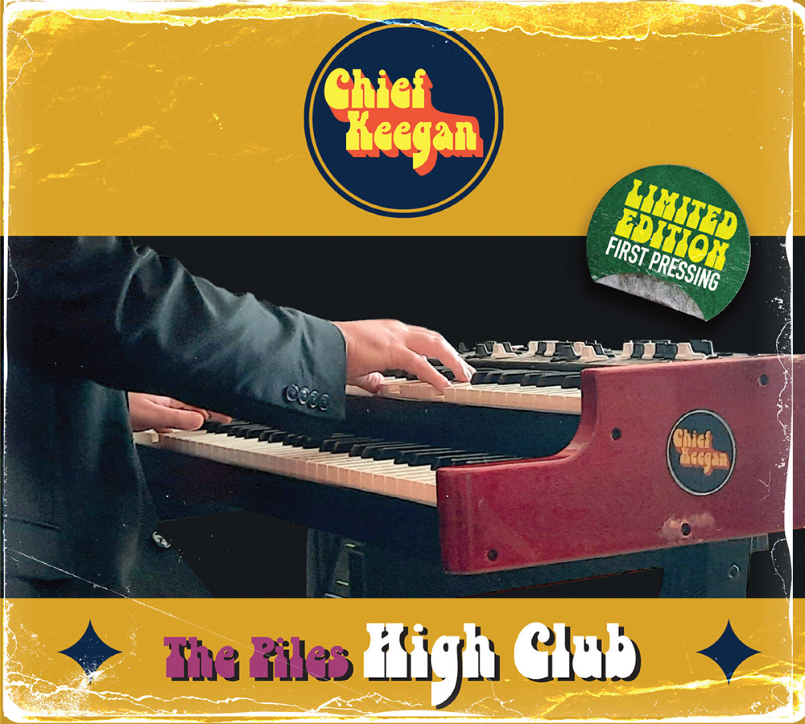
Visual Symbolism – The design features a realistic, action oriented performance photograph across the central horizontal band, capturing a musician's hands playing a vintage double manual electronic organ. This musical theme is beautifully layered into a retro graphic architecture, using a distressed, worn edge paper texture overlay across the main jacket framing. The aesthetic transitions seamlessly onto the physical media format, where a classic black vinyl record peeks out, complete with a custom grooved texture and a split violet and navy centre label that mirrors the underlying vintage soul, blues, and funk energy.
Typographic Architecture – A playful, bubble style 1970s psych rock display typeface blocks out the primary album title "The Piles High Club" across the lower mustard yellow banner, flanked by minimalist navy blue diamond vector accents. The band's identity is anchored inside a bold circular logo emblem reading "Chief Keegan" at the upper centre, rendered in a high contrast yellow casual font against a deep navy blue background. The overall layout relies on a simple, centered typographic alignment to keep a lightweight information hierarchy optimised for immediate recognition on retail shelves or digital streaming grids.
Premium Presentation – The promotional artwork is presented in a premium 3D vinyl record mock up perspective showcasing a dual unit configuration. The square cardboard record sleeve jacket stands vertically, elegantly flanked by the physical black vinyl LP extending outward from behind the right margin to showcase complete design continuity, authentic grooved material reflections, and realistic edge depth against an atmospheric, out of focus golden studio backdrop.
Strategic Colour Choice – A sophisticated, vintage inspired palette of deep mustard yellow, rich navy blue, and warm crimson organ tones forms the core brand signature elements and graphic panels, heavily contrasted by energetic pops of retro violet text. This distinct, earth toned palette evokes immediate analog nostalgia, funk lounge logic and a highly recognisable indie band identity that stands out beautifully in a physical record shop display or digital audio marketplace.
Target Audience Focus – The structured, heritage first layout is tailored to engage dedicated vinyl collectors looking for authentic physical releases, funk, blues, and organ jazz audio enthusiasts seeking immersive instrumental storytelling and retail music shoppers demanding a transparent, highly professional package design that beautifully honors a classic analog aesthetic.