
The Oxfordshire Property Agent Flyer Design
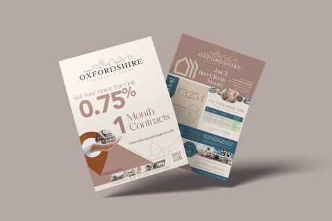
This portfolio showcase highlights the commercial print architecture and direct mail marketing layout for The Oxfordshire Property Agent Flyer Design. The objective was to design a highly professional, sophisticated, and trustworthy marketing flyer that bridges high end real estate authority with an informative graphic design layout, instantly communicating transparent fee structures, contract flexibility, and structured property communication.
Design & Requirements Breakdown
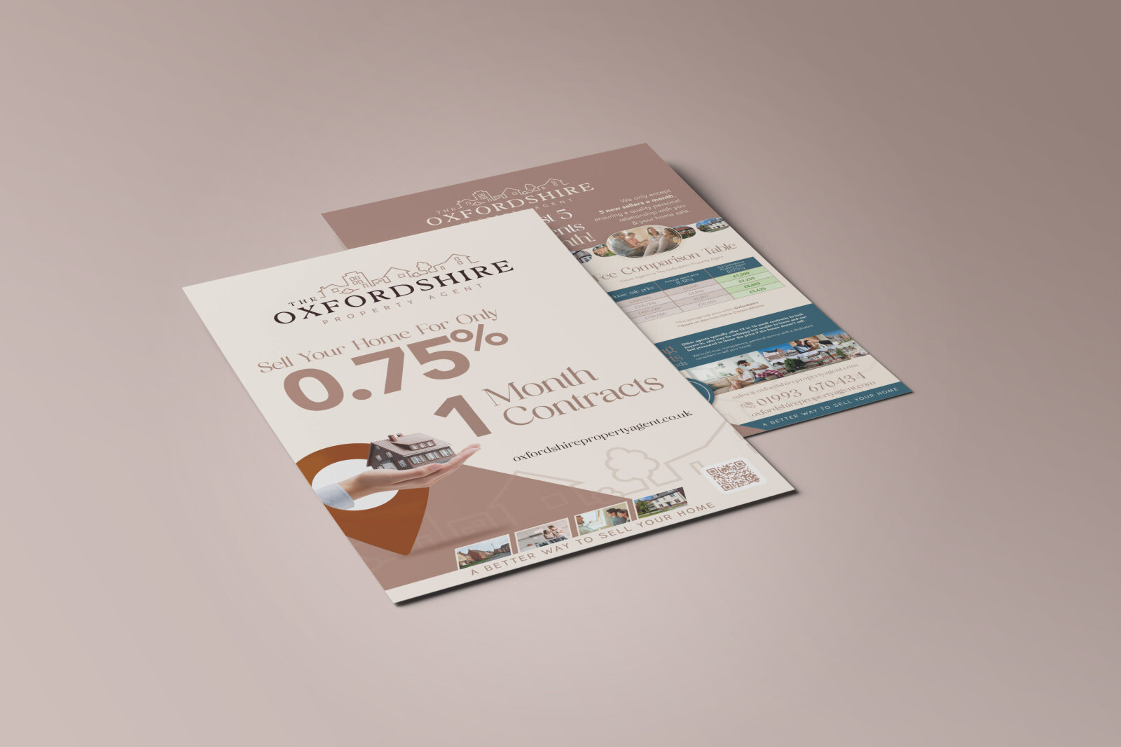
Visual Symbolism – The design features a realistic, high fidelity miniature house resting gently in a hand, framed beautifully within a stylised, cut out pin drop graphic on the front cover. This real estate theme is elegantly mirrored across the layout via the "The Oxfordshire Property Agent" corporate brand mark, which incorporates fine, ornamental filigree above the logotype. On the reverse face, stylised, linear house icons and a structured fee comparison grid are paired with local lifestyle imagery, visually reinforcing regional market authority, transparent pricing models and corporate clarity.
Typographic Architecture – A refined, classic serif display typeface blocks out the agency name, accompanied by a smaller, clean sans-serif tagline. The primary financial incentive, "0.75%", is displayed in a massive, elegant muted mauve font to instantly command attention, paired seamlessly with a bold "1 Month Contracts" headline. On the reverse side, highly legible sans-serif data blocks outline fee savings alongside structured contact fields, utilising a balanced information hierarchy optimised for effortless reading during complex financial decisions.
Premium Presentation – The promotional collateral is presented in a premium 3D print mock up perspective showcasing a two page floating arrangement with the front cover overlapping the detailed reverse canvas, casting realistic shadows on a soft, neutral studio backdrop. This dynamic composition accentuates the dual sided narrative flow, precise margin alignments, and crisp edge definitions, offering a highly tactile and realistic preview of a complete direct mail marketing asset.
Strategic Colour Choice – A sophisticated, premium palette of deep slate blue, warm terracotta, and muted mauve forms the core brand signature blocks and editorial accents, heavily contrasted by a crisp white writing canvas and soft, off white background tones. This distinct, elegant palette evokes immediate consumer trust, premium local lifestyle association and a highly recognisable property brand identity that stands out from typical high street competition.
Target Audience Focus – The structured, value first layout is tailored to engage premium residential homeowners looking for competitive estate agency fees, independent property sellers seeking a flexible, non restrictive contract partnership, and local Oxfordshire residents demanding transparent, highly professional real estate consultations that maximise asset returns.