
The Outlaw By Country Beast Cd Cover Design
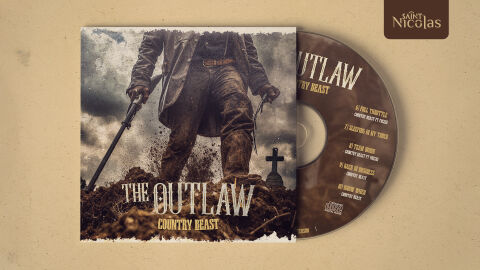
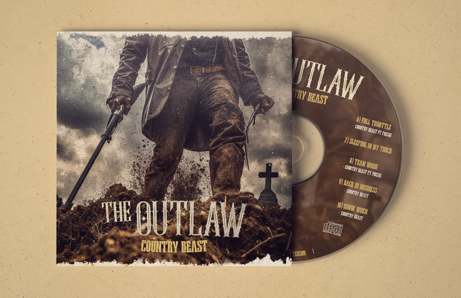
This portfolio artwork design piece highlights the commercial print layout, disc surface architecture, and packaging narrative for the Country Beast The Outlaw studio album. The objective was to design a highly atmospheric, gritty and raw cinematic CD cover system that bridges classic outlaw country imagery with aggressive Southern rock aesthetics, instantly communicating a sense of rugged rebellion, dark storytelling, and a striking product identity for retail distribution.
Design & Requirements Breakdown
Visual Symbolism – The design features a dramatic, low angle shot of a lone cowboy figure standing atop a freshly dug grave site, serving as the core visual narrative. Clad in a weathered duster jacket and muddy jeans, the character holds a shotgun in one hand and a revolver in the other, establishing an intense mood of vengeance and survival. This evocative central image is layered into the graphic architecture alongside a brooding, storm swept sky and a solitary grave marker cross. This visual configuration seamlessly reinforces heavy underlying themes of lawlessness, moral ambiguity and the gritty, uncompromising spirit of Americana storytelling.
Typographic Architecture – The layout blocks out the main title "THE OUTLAW" across the lower quadrant of the cover art using a highly stylised, Western inspired serif font with a heavy, distressed woodblock texture. Directly beneath, the artist moniker "COUNTRY BEAST" is rendered in a sharp, high contrast block display typeface in a muted gold tone. This deliberate typographic alignment extends directly onto the face of the physical CD disc, which neatly displays a vertical, clean sans-serif track list structure. The resulting typographic architecture maintains an efficient hierarchy optimised for legibility while locking in a cohesive, period accurate branding signature across both the booklet jacket and physical media.
Premium Presentation – The promotional artwork is presented in a high fidelity print preview composition, showcasing the square CD cover art resting alongside the partially revealed compact disc against a textured, sand toned kraft paper backdrop. This focused presentation layout emphasises the sharp resolution of the distressed photo manipulation, the intricate metallic textures of the disc surface print and the realistic print bleed edges, offering a highly tactile and professional preview of a completed commercial music release ready for distribution.
Strategic Colour Choice – A sophisticated, moody palette of earthy browns, muddy greys, and desaturated olive tones forms the primary visual canvas, establishing an immediate sense of cinematic gravity and vintage sepia tone. This rugged foundation is punctuated by strategic hits of warm amber and muted gold in the typography, as well as the deep metallic charcoal used for the matching disc face layout. This distinct colour configuration injects an immediate sense of gritty authenticity, ensuring the package stands out beautifully to collectors of premium physical music releases.
Target Audience Focus – The structured, concept first layout is meticulously tailored to engage dedicated fans of outlaw country, Southern rock and alternative Americana music who value immersive visual world building and tangible physical media. It captures the attention of retail music shoppers and audiophiles demanding a transparent, highly professional package design that beautifully honours the album's raw, cinematic, and rebellious themes.