
The Law Of Attraction Book Cover Design
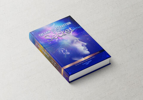
This portfolio showcase highlights the commercial cover illustration and print jacket layout for The Law of Attraction & The Secret Book Design Cover. The objective was to design a highly professional, striking, and ethereal book cover that bridges spiritual philosophy with vibrant digital design, instantly communicating mental focus, cosmic manifestation and an engaging visual narrative that stands out on a physical or digital bookstore shelf.
Design & Requirements Breakdown
Visual Symbolism – The design features a stylised, low opacity profile portrait of a man looking upward in deep meditative contemplation, seamlessly integrated into the central canvas. This manifestation theme is beautifully layered into the graphic architecture via an immersive cosmic background filled with swirling celestial nebulas, glowing starlight fractures and dynamic light paths emitting from the mind, visually reinforcing mental clarity, universal connectivity and the limitless power of human consciousness.
Typographic Architecture – A clean, modern sans-serif display typeface blocks out the initial title "THE LAW OF ATTRACTION & THE SECRET" across the upper half, utilising a high contrast white font. Directly underneath, the focal word "Secret" is rendered in a dramatic, flowing chrome textured script font with an ethereal purple and white glow to instantly capture reader focus. The lower canvas integrates a dark crimson horizontal banner carrying a clean white sub tagline, while a dedicated publisher emblem anchors the bottom margins to keep a lightweight information hierarchy optimised for effortless reading.
Premium Presentation – The promotional asset is presented in a premium 3D book mock up perspective showcasing a single hardcover volume resting at a dynamic angle on a textured white studio backdrop. This composition emphasises mass print production quality, book spine depth, and realistic lighting reflections across the glossy laminated jacket, offering a highly tactile and immersive preview of a completed commercial editorial touch point.
Strategic Colour Choice – A sophisticated, mind expanding palette of deep space blues, vibrant magenta's, and electric purples forms the core brand signature canvas, heavily punctuated by high visibility pops of golden tan on the spine elements and white light flares across the main cover matrix. This distinct, high contrast palette evokes immediate spiritual curiosity, manifestation logic, and an easily recognisable literary identity that commands attention from passing wellness readers.
Target Audience Focus – The structured, concept first layout is tailored to engage everyday readers looking to unlock personal manifestation techniques, mindfulness practitioners seeking advanced cognitive transformation tools, and self-help enthusiasts demanding an engaging, transparent and authoritative exploration of universal mind power laws.