
The Kew Window Cleaning Services Flyer Design
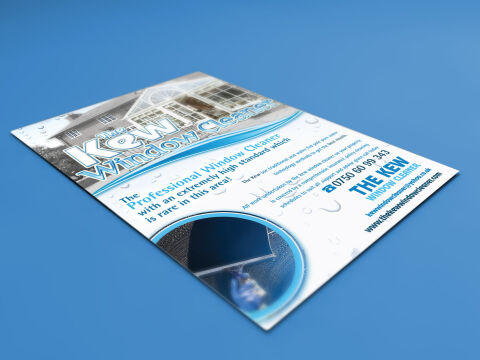
This portfolio showcase highlights the commercial print architecture and advertising layout for The Kew Window Cleaner promotional flyer design. The objective was to design a highly professional, clean, and refreshing marketing flyer that bridges local trade authority with fluid graphic design, instantly communicating service precision, operational reliability, and structured business communication.
Design & Requirements Breakdown
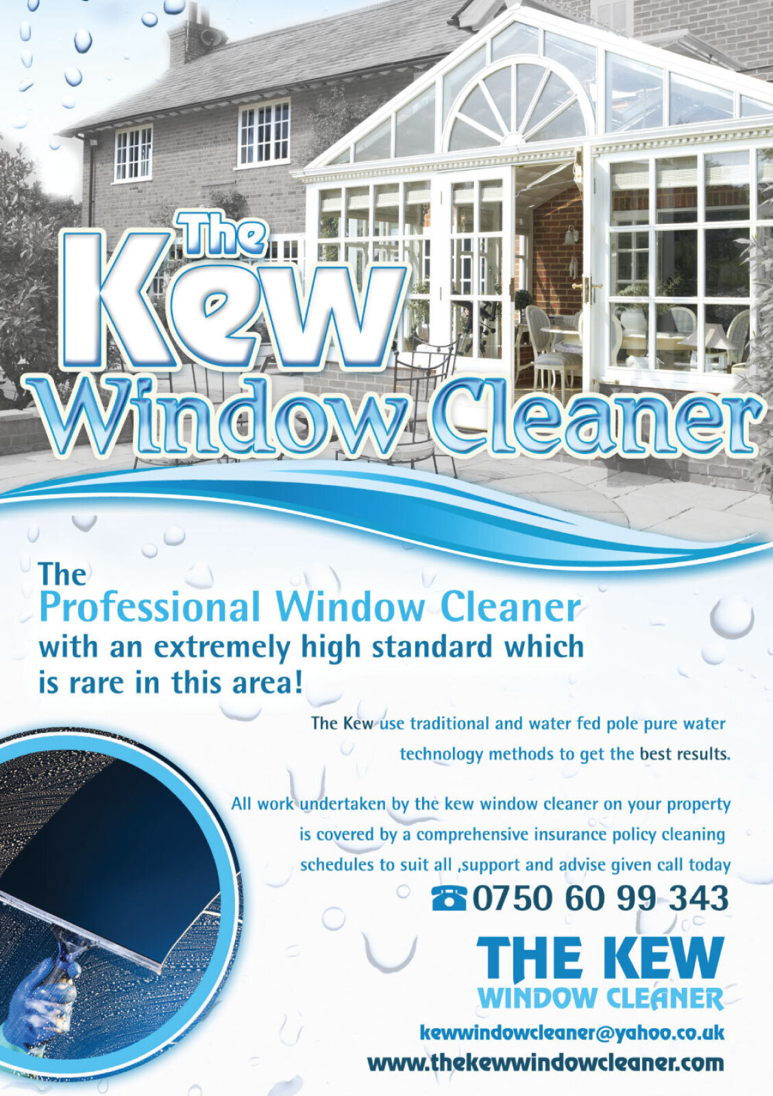
Visual Symbolism – The design features a stylised, curved header displaying a grand residential property with pristine windows, integrated seamlessly with the bold "The Kew Window Cleaner" brand logotype. This aquatic theme is echoed beautifully across the background canvas via large, high definition water droplet graphics and sweeping, low opacity ice blue fluid waves that curve across the center margins, visually reinforcing sparkling clarity, professional water fed pole systems, and corporate transparency.
Typographic Architecture – A bold, modern sans-serif display typeface blocks out the primary service announcement "The Professional Window Cleaner" in a vibrant azure blue, accompanied by a smaller, refined sub tagline emphasising an extremely high standard of service. In the lower right hand margin, an ultra legible, heavy sans-serif typeface maintains a highly precise alignment, balancing essential contact numbers, company email links, and digital web communication paths to keep a lightweight information hierarchy optimised for effortless reading.
Premium Presentation – The promotional collateral is presented in a premium 3D print mock up perspective resting at an angle on a deep, solid blue studio backdrop. This dynamic composition showcases a single, official printed flyer sheet embedded with an integrated circular action shot in the lower quadrant revealing a squeegee cutting through water demonstrating clean paragraph grid alignment and professional margins.
Strategic Colour Choice – A sophisticated, professional palette of deep royal blue, bright azure blue, and soft sky blue forms the core brand signature and fluid wave gradients, heavily contrasted by a crisp white paper writing canvas and the realistic glass textured header. This distinct, high contrast palette evokes immediate consumer trust, domestic hygiene logic, and a clean, recognisable local service brand identity.
Target Audience Focus – The structured, service first layout is tailored to engage premium residential homeowners looking for elite domestic maintenance, commercial property managers seeking reliable window cleaning partnerships, and local residents demanding transparent, highly professional emergency or routine trade communication.