
The Green Horse Book Cover Design
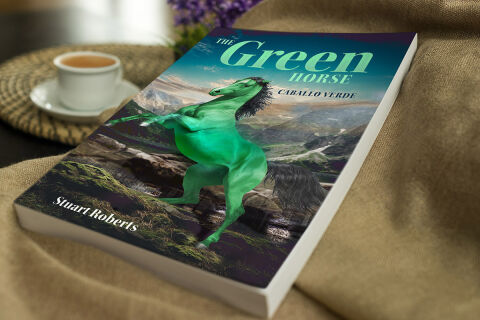
This portfolio showcase highlights the commercial cover illustration and print jacket layout for The Green Horse (Caballo Verde) Book Design Cover. The objective was to design a highly professional, striking and majestic book cover that bridges epic fantasy or magical realism with vivid digital composition, instantly communicating untamed power, breathtaking natural landscapes and an engaging visual narrative that stands out on a physical or digital bookstore shelf.
Design & Requirements Breakdown
Visual Symbolism – The design features a magnificent, surreal digital illustration of a powerful green stallion rearing up proudly in the centre foreground. This mystical theme is beautifully layered into the graphic architecture via an expansive background canvas showcasing a dramatic, sweeping mountain valley beneath a bright sky, while the lower foreground captures mossy stone terrain, visually reinforcing wildlife majesty, legendary journeys and a sense of cinematic environmental scale.
Typographic Architecture – A stylised, sweeping serif display typeface blocks out the primary title "The Green Horse" across a deep teal sky gradient in the upper quadrant, utilising a vibrant mint green tone for the word "Green" to mirror the central subject matter. Directly beneath this, a clean serif subtitle blocks out the translation "CABALLO VERDE" in a stark white font. The lower left margin neatly anchors the author’s name "Stuart Roberts" in a classic, high contrast white serif typeface to keep a lightweight information hierarchy optimised for effortless reading.
Premium Presentation – The promotional asset is presented in a premium 3D book mock up perspective showcasing a single paperback volume resting gently on a soft, textured tan fabric surface alongside a cozy coffee cup in the background blur. This warm, lifestyle oriented composition emphasises mass print production quality, clean paper page edges, and realistic fabric shadows, offering a highly tactile, inviting, and atmospheric preview of a completed commercial editorial touch point.
Strategic Colour Choice – A sophisticated, nature focused palette of deep teal, rich earth tones, and crisp mountain whites forms the core background canvas, heavily punctuated by the striking emerald and mint greens of the stallion and title typography. This distinct, high contrast palette evokes immediate narrative curiosity, legendary folklore logic and an easily recognisable literary identity that commands attention from passing readers.
Target Audience Focus – The structured, concept first layout is tailored to engage everyday fiction readers looking for sweeping adventure tales, fantasy enthusiasts seeking legendary or mystical creature stories, and digital bookstore shoppers demanding a high quality, visually striking cover design that promises an immersive, unforgettable storytelling experience.