
The Art of Piano by Ulrich Roman Murtfeld - Music Anthology Design
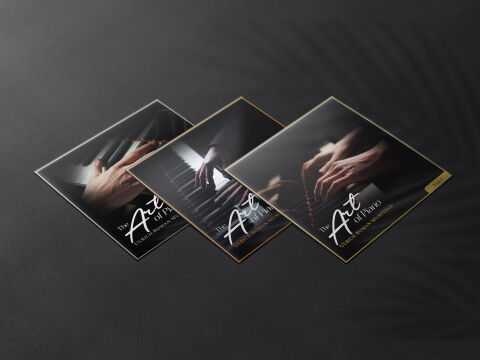
This portfolio piece highlights the prestigious art direction and sophisticated, heritage focused layout architecture for Ulrich Roman Murtfeld’s multi-volume music anthology, "The Art of Piano." The design objective was to build a refined, deeply expressive cover art collection that perfectly fits premium classical piano recordings and masterwork collections. The layout relies on cinematic, low key documentary photography to instantly establish themes of focus, mastery and artistic devotion, optimised for a strong presence on both physical merchandise and digital streaming services.
Design & Requirements Breakdown
Typographic Architecture – The design uses a coordinated, stylised typography layout anchored cleanly in the lower half of the composition to maintain a harmonious balance with the visual imagery. The series title "The Art of Piano" is rendered as a striking contrast, pairing a flowing, expressive white script for "Art" with a structured, timeless serif font for "Piano." Directly underneath, the artist’s name "ULRICH ROMAN MURTFELD" is displayed in a clean, minimalist sans-serif typeface, guaranteeing absolute clarity and professional brand identity across the entire anthology series.
Premium Presentation – The promotional artwork is displayed as a high fidelity collection preview, positioning three square cover designs in a dynamic, angled layout against a dark, textured studio background. The background features a subtle, elegant shadow interplay that adds real world depth and a tactile quality to the presentation. Each cover variant is framed by a thin, premium metallic border individually rendered in polished silver, warm bronze, and brilliant gold which differentiates the volumes while giving the entire set a cohesive, collectible and high end aesthetic.
Strategic Colour Choice – The colour palette relies on a rich, moody tonal scheme dominated by deep charcoals, soft ambient light and stark whites, establishing an intimate and timeless concert hall atmosphere. By keeping the imagery deeply atmospheric, the focus shifts entirely to the raw, expressive motion of the hands on the keys. The deliberate addition of the metallic gold, silver and bronze borders introduces a luxurious touch of colour, ensuring each volume stands out independently while maintaining an elite, unified brand ecosystem.
Target Audience Focus – The elegant, performance first layout is meticulously crafted to engage enthusiasts of classical piano masterworks, audiophiles and physical CD collectors looking for premium aesthetic packaging. It targets discerning music consumers demanding an authentic, highly professional design that honours classical music heritage and visually reflects the profound technical mastery of the performances within.