
Tequila In The Jar By Mariachi San Patricio Music Album Cover Design
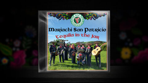
This portfolio design highlights the commercial print layout and graphic architecture for the Mariachi San Patricio Tequila in the Jar Music Album CD Cover Design. The objective was to design a highly atmospheric, culturally vibrant and festive album cover that seamlessly bridges traditional Mexican mariachi heritage with Celtic musical roots, instantly communicating a lively fusion sound, multi cultural celebration and a striking product identity for retail distribution.
Design & Requirements Breakdown
Visual Symbolism – The design features an authentic group portrait of the mariachi band in traditional charro attire set within a lush, green landscape, serving as the core visual narrative. Directly above this central scene, a prominent Celtic harp emblem enclosed in a green circular knot work seal anchors the upper header. This symbolic seal is beautifully flanked by intricate, hand painted Mexican style floral embroidery patterns. This unique juxtaposition of cultural icons the Irish harp and Celtic knots paired with classic Mexican folk art and mariachi dress powerfully reinforces the album’s thematic blending of Mexican and Irish musical traditions.
Typographic Architecture – The layout utilises an elegant, dual cultural font hierarchy to manage the release identity across the upper half of the composition. The artist's name "Mariachi San Patricio" is blocked out in a stylised, bold Celtic inspired typeface that establishes an immediate connection to Irish heritage. Directly beneath, the album title "Tequila in the Jar" (a clever nod to the classic folk song Whiskey in the Jar) is rendered in a flowing, festive red cursive font. This deliberate typographic alignment creates an effortless information hierarchy optimised for maximum legibility across digital streaming thumbnails and brick and mortar retail shelves.
Premium Presentation – The promotional artwork is presented in a high fidelity digital and print preview composition, displaying the square jewel case booklet angled precisely against a dark, atmospheric studio backdrop subtly textured with traditional floral elements. This focused mock up layout emphasises the sharp print resolution, the vibrant outdoors photography, and the realistic plastic shrink wrap reflections, offering a highly tactile and professional preview of a completed commercial music release ready for manufacturing or physical distribution.
Strategic Colour Choice – A sophisticated, lively palette of rich emerald greens, bright sky blues, and warm grass tones forms the core brand canvas, mirroring the natural landscape of the photography. This organic base is heavily contrasted by the festive pops of crimson red in the typography and the vibrant, multi coloured floral accents in the upper graphic architecture. This distinct colour configuration injects an immediate sense of energy, cultural authenticity and cross genre intrigue that cuts through competing digital store fronts and traditional compilation displays.
Target Audience Focus – The structured, concept first layout is meticulously tailored to engage world music enthusiasts looking for refreshing cultural crossover arrangements, folk music collectors seeking unique physical releases, and retail music shoppers demanding a transparent, highly professional package design that beautifully honors both Mexican and Irish musical legacies.