
Summer Waves With Best Friends by Jerry Collins - EP Design
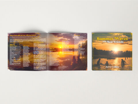
This portfolio artwork showcases the comprehensive physical packaging layout for Jerry Collins’s Summer Waves with Best Friends EP. The design objective was to build a nostalgic, emotionally resonant and warm physical product that captures the essence of summer, friendship and personal reflection. The layout bridges a striking, sunset drenched cover image with an immersive gatefold interior, creating a cohesive storytelling experience tailored for physical collectors.
Design & Requirements Breakdown
Visual Symbolism - The design heavily utilises natural sunset imagery over a serene body of water, featuring silhouettes of friends wading and relaxing in the shallows. This central visual metaphor represents fleeting youth, shared memories and the peaceful warmth of lifelong bonds. By centering the photography around the golden hour, the visuals evoke an instant sense of nostalgia and emotional comfort, perfectly mirroring the reflective lyrical themes of the EP.
Typographic Architecture - The design employs a distinct, bold serif typeface with a retro flare for the primary titles, rendered in a bright, sun kissed yellow that pops against the background. On the cover, "Summer Waves" is given maximum typographic weight, followed by an elegant, script like "with Best Friends" sub-headline, and a clean serif for the artist name, "Jerry Collins." The inner gate fold organises the lyrics into structured columns split into "Side A" and "Side B," using crisp, readable white text that maintains a balance between high density and clean editorial scannability.
Premium Presentation - The promotional layout is presented as a high end physical mock up against a clean, neutral studio background to emphasise the product's tactile quality. On the right, the closed front cover displays the precise layout lines and border framing. On the left, the fully opened inner booklet or gate fold layout demonstrates how the panoramic sunset imagery seamlessly stretches across the spine, creating a continuous, immersive horizontal landscape for the listener.
Strategic Colour Choice - The palette is dominated by rich, warm golden hour tones of vibrant oranges, deep ambers and radiant yellows contrasted gently against the cool, dark silhouettes and deep blues of the water. This colour theory creates an immediate sensory feeling of physical heat and emotional intimacy. The choice of yellow and white text guarantees maximum contrast and readability over the complex, textured background photography, ensuring the package feels premium and accessible.
Target Audience Focus - This layout is strategically designed to attract vinyl, CD, and physical media collectors who value immersive booklet packaging, fans of acoustic, indie, or nostalgic summer anthems and music consumers looking for a physical keepsake that translates auditory storytelling into a tangible, visually beautiful and high quality artistic product.