
Sugavida Palmyra Range Packaging Label Designs
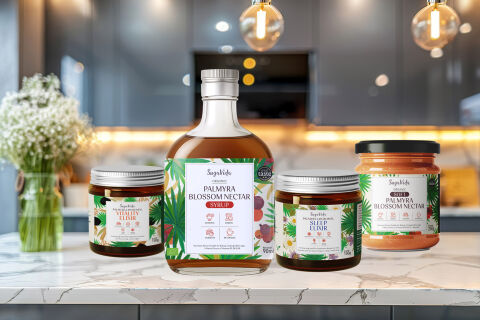
This portfolio artwork highlights the elegant, wellness focused art direction and organic layout architecture designed for SugaVida’s premium Palmyra product line. The design objective was to build a cohesive, high and family of labels that communicates natural vitality, holistic health and pure plant based nutrition across multiple product formats, including a signature Palmyra Blossom Nectar Syrup bottle and specialised wellness elixir jars. The visual strategy relies on a unified, tropical infused structural grid that scales effortlessly across different glass containers, ensuring immediate brand recognition within the competitive organic superfood and natural sweetener markets.
Design & Requirements Breakdown
Visual Symbolism – Each label features an intricate, hand illustrated framing border of lush green Palmyra palm fronds and vibrant tropical flora that anchors a crisp white central informational panel. This organic visual structure immediately evokes pure botanical sourcing, natural farming heritage and holistic wellness, beautifully complemented by clear glass bottles, amber apothecary style jars and a bright, premium marble kitchen countertop background that positions the range as an essential, high end lifestyle product.
Typographic Architecture – A graceful, custom script brand logo gives "SugaVida" an authentic, artisanal identity, which is perfectly balanced by structured, clean serif and sans serif headers for product names like "PALMYRA BLOSSOM NECTAR", "VITALITY ELIXIR", and "SLEEP ELIXIR." This hierarchy is supported by clean minimalist benefit call outs and simple, elegant icon badges detailing health properties (such as energy, immunity, or sleep support) to guarantee maximum on shelf clarity and premium digital presence.
Premium Presentation – The clean, wraparound label design maximises front of pack visual real estate while allowing a prominent "Great Taste Award" seal to sit proudly on the corner margin. The layout seamlessly integrates essential regulatory text, nutritional breakdowns and product weights onto the side panels, maintaining a clean and uncluttered front face that allows the rich amber, golden and terracotta tones of the natural syrups and powders inside the containers to elevate the premium aesthetic.
Strategic Colour Choice – A crisp, clinical yet warm white background base is beautifully framed by deep forest greens, subtle earthy browns and soft floral accents. A deliberate colour coding system such as the rich terracotta orange used for the powder jar or the vibrant red accents on the syrup bottle is employed to clearly differentiate the product types and flavours while maintaining a strictly unified, sophisticated brand ecosystem across the entire health range.
Target Audience Focus – The clean, nature first packaging layout is meticulously tailored to engage health conscious consumers, wellness practitioners and culinary enthusiasts prioritising organic, low glycemic plant alternatives. It targets discerning shoppers demanding an authentic, highly professional product design that honours traditional nutritional wisdom while fitting seamlessly into a modern, health focused kitchen.