
StiimPak Show Steamers Packaging Design
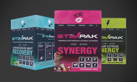
This portfolio showcase highlights the packaging design and multi flavor box collection execution for StiimPak Premium Performance Shower Steamers. The objective was to design a vibrant, high impact retail box system that transitions traditional wellness products into a high octane sensory experience, instantly communicating dynamic aromatherapy benefits, active performance enhancement, and unique scent profiles.
Design & Requirements Breakdown
Visual Symbolism – The design integrates a structured grid layout featuring thematic top icons (a medical cross for Recovery, a graffiti "XOXO" kiss for Synergy, and a lightning bolt for Energy) that immediately anchor each variant's functional purpose. High resolution ingredient collages such as fresh strawberries, lime wedges, and mint leaves are paired with functional vector step by step usage illustrations on the side panels to visually guide the consumer through the optimal shower placement process.
Typographic Architecture – A sharp, futuristic sans-serif typeface gives the "STIIMPAK" brand logo an aggressive, lifestyle performance aesthetic, perfectly balanced by a bold block font for the flavour identities ("LEMONGRASS MINT RECOVERY", "SYNERGY", and "SOUR CITRUS ENERGY"). A neat cluster of uniform icon badges details specific ingredient callouts (such as L-Theanine and Ginseng) at the base for immediate feature recognition.
Premium Presentation – The structural layout showcases three distinct folding cartons arranged side by side, demonstrating a highly organised multi sku architecture. The design utilises a full bleed wraparound format, ensuring that critical technical specifications, box counts (6 Paks, 80g Each), and step by step instructions flow seamlessly around the box without compromising the front of pack retail impact.
Strategic Colour Choice – Deep slate charcoal backgrounds provide a dark, modern baseline across the entire line, which is heavily contrasted by variant specific neon colours: a crisp glacial blue for Lemongrass Mint, a striking magenta pink for Strawberries & Cream, and an energetic lime green for Sour Citrus to evoke rapid sensory activation and clear shelf differentiation.
Target Audience Focus – The intense, benefit driven layout is tailored to engage active individuals seeking a fast acting morning boost, fitness enthusiasts looking for refreshing post-workout recovery, and modern consumers demanding a premium, high performance aromatherapy routine.