
Spend Your Nickel by Michael Prysock - Music Single Cover Design
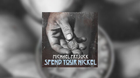
This portfolio design artwork piece highlights the commercial art direction and gritty, heritage focused layout architecture for Michael Prysock’s single release, "Spend Your Nickel." The design objective was to build a raw, vintage themed cover art piece that perfectly fits acoustic blues, Americana and working class folk music. The layout heavily relies on tactile, weathered elements to immediately establish themes of value, trade, and hard work, optimised for high impact presence on digital streaming services and physical CD merchandise.
Design & Requirements Breakdown
Visual Symbolism - The artwork features a gritty, highly detailed close up of a weathered, working hand offering or holding an old fashioned silver coin between the thumb and fingers. This central visual narrative represents commerce, personal sacrifice and the literal weight of hard earned money. The rough skin texture and the rustic, distressed canvas behind the hand act as a powerful visual metaphor for blue collar resilience, reinforcing the single's literal and down to earth title, "Spend Your Nickel."
Typographic Architecture - The design uses a coordinated, stylised typography layout anchored cleanly in the lower third of the composition. The artist’s name "MICHAEL PRYSOCK" is rendered in a sharp, geometric white serif font, creating a modern, readable brand identity. Directly underneath, the track title "SPEND YOUR NICKEL" is displayed in an elongated, custom Art Deco inspired typeface coloured in a pale, ice blue hue with thin horizontal bars slicing through the characters, adding a historic yet unique structural element to the design.
Premium Presentation - The promotional artwork is displayed as a high fidelity digital single preview, positioning the square cover design against an expansive, de-saturated studio vignette backdrop. The background consists of a heavily blurred close up of the historical coin and hand textures from the artwork. This out of focus background treatment framing the composition creates an added layer of atmosphere and depth, drawing the viewer's immediate focus to the crisp details and boundaries of the core CD art.
Strategic Colour Choice - The colour palette relies on a moody, de-saturated monochromatic base of deep charcoals, gritty greys and weathered stone textures. This cold, industrial environment is subtly broken up by the unique, muted ice blue tone chosen for the track title typography. This specific contrast ensures that the song title remains instantly legible and highly eye catching, cutting through the dark textures of the hand and background even when scaled down to a small streaming thumbnail.
Target Audience Focus - The historic, narrative first layout is meticulously crafted to engage enthusiasts of traditional storytelling music, vinyl and CD collectors looking for premium aesthetic packaging, and music consumers demanding a raw, highly professional design that respects traditional American music heritages.