
Social Media Design for the Oxfordshire Property Jargon Buster Advert
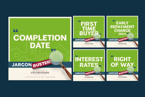
This project features an educational micro campaign suite designed for The Oxfordshire Property Agent. Expanding on the brand's content marketing strategy, this specific "Jargon Buster" series was created to demystify complex real estate terminology, making the home buying and selling process more approachable while positioning the agency as a helpful local resource.
Design & Requirements Breakdown
Visual Identity - The campaign maintains strict brand consistency by utilising the agency's signature olive green and clean white corporate colours, contrasted with a playful crimson banner to emphasise the "Jargon Buster" sub-brand.
Modular Template Layout - A seamless, grid-based template system was developed to effortlessly scale across multiple industry terms (such as Completion Date, First Time Buyer, Early Repayment Charge, Interest Rates, and Right of Way) while preserving uniform logo and tagline placements.
Graphic Motifs & Texturing - Large, elegant quotation marks and a subtle vector background of cloud and house line art reinforce the educational, glossary style nature of the posts without cluttering the canvas.
Visual Anchor Integration - A high quality 3D asset of a vintage magnifying glass is layered across the bottom right corner of each graphic, serving as a clever visual metaphor for closely examining and clarifying complex details.