
So Short A Time By Stone Alibi Music Single Cover Design
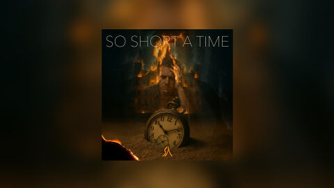
This portfolio design artwork highlights the commercial print layout and graphic architecture for the Stone Alibi So Short A Time Music Single CD Cover Design. The objective was to design a highly atmospheric, conceptually intense and emotionally raw CD single cover that bridges alternative rock, indie, and cinematic music styles with premium packaging, instantly communicating a sense of fleeting mortality, psychological tension and a striking product identity for retail and digital distribution.
Design & Requirements Breakdown
Visual Symbolism – The design features a multi layered surrealist composition that serves as the core visual narrative. At the foreground, an antiqued pocket watch sits half buried in a desolate terrain, acting as a direct literal and metaphorical representation of passing time. Looming in the background is a ghostly, double exposed portrait of a man holding his head in distress, seamlessly integrated with a grand stately house engulfed in raging fire and smoke. A glowing spark and embers burn in the lower left corner of the graphic architecture, beautifully reinforcing heavy underlying themes of existential grief, burning memory and internal crisis.
Typographic Architecture – The layout positions the track title "SO SHORT A TIME" across the upper third of the canvas in an ultra clean, minimalist sans-serif font. The lettering features a fine, lightweight line weight that cuts sharply through the dark, chaotic textures of the background imagery. This deliberate typographic alignment establishes a contemporary, high end editorial feel that avoids distracting from the complex digital imagery, ensuring excellent legibility on streaming platforms while maintaining a modern, polished alternative branding signature.
Premium Presentation – The promotional artwork is presented in a high fidelity digital and print preview composition, framing the square single cover art at the centre against a warm, heavily blurred vignette backdrop that mirrors the fiery tones and shadows of the central design. This focused presentation layout emphasises the sharp resolution of the digital collage, the deep shadow casting, and the subtle, warm atmospheric lighting, providing a highly tactile and professional preview of a completed commercial music release ready for digital audio distribution.
Strategic Colour Choice – A sophisticated, moody palette of deep charcoal greys, earthy browns, and dense blacks forms the primary visual canvas, establishing an immediate sense of cinematic gravity. This dark foundation is dramatically pierced by the brilliant, high contrast amber and orange tones of the burning flames and glowing embers. This distinct colour configuration injects immediate visual energy, balances the darker psychological themes, and ensures the package stands out beautifully on digital storefronts and streaming platform playlists.
Target Audience Focus – The structured, concept first layout is meticulously tailored to engage dedicated alternative and indie rock enthusiasts looking for immersive visual storytelling, modern audiophiles drawn to emotionally driven or cinematic concepts and digital music consumers demanding a transparent, highly professional package design that beautifully honours the track's raw, emotional and thought provoking theme.