

So Bright Inside By Stone Alibi Single Cover Design
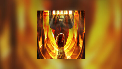
This portfolio piece highlights the commercial print layout and graphic architecture for the Stone Alibi So Bright Inside Music Single CD Cover Design. The objective was to design a highly atmospheric, visually cinematic and emotionally intense single cover that bridges alternative rock, progressive indie and dramatic electronic musical heritage with premium physical and digital packaging, instantly communicating a sense of spiritual awakening, textured depth and a striking product identity for retail distribution.
Design & Requirements Breakdown
Visual Symbolism – The design features a silhouette of a woman standing at the centre, illuminated by an intense, ethereal glow within a cathedral like structure, serving as the core visual narrative. Beams of dramatic heavenly light stream downward from arched windows at the top of the graphic architecture, piercing through a dark, monolithic central form. This focal imagery is surrounded by sweeping, golden geometric rings of light that wrap around the composition. This evocative layout seamlessly reinforces themes of inner strength, transformative hope and a powerful personal breakthrough.
Typographic Architecture – The layout blocks out the track title "SO BRIGHT INSIDE" across the upper centre quadrant using a stylised, high contrast sans-serif font. The text is stacked vertically and rendered in a clean, solid white that stands out crisply against the dark architecture behind it. A subtle, hand drawn vector monogram or artist signature emblem is neatly centered at the bottom edge. This deliberate typographic alignment preserves a modern, clean information hierarchy optimised for effortless reading across streaming platforms or physical media displays while maintaining an edgy, alternative branding identity.
Premium Presentation – The promotional artwork is presented in a high fidelity digital and print preview composition, framing the square single cover art at the centre against a warm, heavily blurred studio backdrop that mirrors the vibrant golden and amber tones of the central artwork. This focused vignette layout emphasises the sharp print resolution, the complex light rays, and the deep contrast transitions of the main scene, offering a highly tactile and professional preview of a completed commercial music release ready for digital audio distribution or physical package manufacturing.
Strategic Colour Choice – A sophisticated, high energy palette of radiant golds, fiery oranges and deep amber tones forms the primary visual canvas, creating an intense, cinematic atmosphere. This glowing illumination is heavily contrasted by the deep charcoals and blacks of the architectural silhouettes. This strategic colour choice injects immediate visual tension, ensuring the package cuts through competing alternative album displays in physical and digital retail environments.
Target Audience Focus – The structured, concept first layout is meticulously tailored to engage dedicated alternative rock and indie enthusiasts looking for immersive visual storytelling, modern audiophiles drawn to emotionally driven or cinematic concepts and digital music consumers demanding a transparent, highly professional package design that beautifully honours the track's vibrant and uplifting underlying theme.