
Sentimental Christmas Journey Volume 2 Cd Cover Design
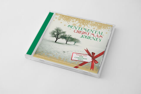
This portfolio showcase highlights the commercial print layout and graphic architecture for the Sentimental Christmas Journey: Volume Two – The Christmas Spell Compilation CD Cover Design. The objective was to design a highly atmospheric, nostalgically resonant and elegant Christmas album cover that bridges classic festive warmth with premium physical packaging, instantly communicating a sense of serene comfort, timeless seasonal magic and a striking product identity for retail distribution.
Design & Requirements Breakdown
Visual Symbolism – The design features a beautifully balanced seasonal landscape at the lower left quadrant of the layout, serving as the core visual narrative. A serene row of bare trees stands rooted in a soft, snow covered field, capturing the peaceful essence of a winter journey. This evocative theme is elegantly paired with an ornate border of glittering gold snowflakes crowning the top of the graphic architecture, juxtaposed against a realistic red satin ribbon and gift tag motif in the lower right. This visual configuration seamlessly reinforces themes of gift giving, nostalgic comfort and the classic, magical storytelling of the Christmas season.
Typographic Architecture – A stylised, festive serif font blocks out the main title "SENTIMENTAL CHRISTMAS JOURNEY" across the upper right quadrant of the layout, utilising alternating deep green and rich crimson tones to establish an immediate festive identity. Directly below, inside a crisp white gift tag frame, the subtitle text "VOLUME TWO – THE CHRISTMAS SPELL" is rendered in a clean, elegant sans-serif and script font pairing. This deliberate typographic alignment creates a lightweight, highly organised information hierarchy optimised for effortless reading across streaming platforms or physical media displays while maintaining a distinct, high end seasonal branding signature.
Premium Presentation – The promotional artwork is presented in a high fidelity digital and print preview composition, displaying the square jewel case booklet angled precisely against a clean, neutral grey studio backdrop. This focused mock up layout emphasises the sharp print resolution, the clarity of the clear plastic casing, and the vibrant festive green spine strip accent, offering a highly tactile and professional preview of a completed commercial music release ready for digital audio distribution or physical package manufacturing.
Strategic Colour Choice – A sophisticated, traditional palette of evergreen, crimson red, and metallic gold forms the core brand signature canvas, heavily contrasted by the bright, clean white tones of the winter landscape. This distinct, elegant colour palette evokes immediate holiday cheer, nostalgic authenticity, and a premium visual identity that effortlessly cuts through competing seasonal store displays and digital storefronts.
Target Audience Focus – The structured, concept first layout is tailored to engage holiday music collectors seeking timeless physical or digital releases, families looking for nostalgic background soundtracks for seasonal gatherings, and retail music shoppers demanding a transparent, highly professional package design that beautifully honors the magic, warmth and emotion of the Christmas season.