
Sensual Tranquillity Cd Cover Design
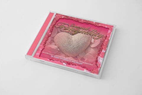
This portfolio showcase highlights the commercial print layout and graphic architecture for the Sensual Tranquillity CD Cover Design. The objective was to design a highly atmospheric, romantic and elegant album cover that bridges contemporary instrumental music with premium retail packaging, instantly communicating a sense of serene romance, premium audio curation and a clear product identity for retail distribution.
Design & Requirements Breakdown
Visual Symbolism – The design features a large, beautifully textured pink glitter heart nestled within a bed of soft, scattered rose petals at the exact epicenter of the layout, serving as the core visual narrative. This romantic, peaceful theme is beautifully layered into the graphic architecture via an intricate, multi layered pink border framed with delicate floating heart accents and soft focus textures. This thoughtful visual configuration seamlessly reinforces themes of relaxation, emotional depth, warmth and a soothing, melody filled journey.
Typographic Architecture – An elegant, sophisticated cursive script font blocks out the main title "Sensual Tranquillity" in a luxurious gold toned gradient across the upper centre quadrant, using soft drop shadows to lift it off the background. Along the lower margin, a clean, all caps white sans-serif font structures the secondary descriptive tag, "20 GORGEOUS CONTEMPORARY ROMANTIC INSTRUMENTALS / ALL TRACKS PERFORMED BY PAUL KENNEDY", keeping a lightweight information hierarchy optimised for listeners scanning retail displays or digital platforms.
Premium Presentation – The promotional artwork is presented inside a high fidelity retail jewel case mock up perspective, showcasing the front booklet layout sitting behind a realistic clear plastic protective tray and a vibrant rose pink spine strip. The presentation is set at an angled, perspective orientation against a neutral, smooth white studio backdrop, capturing realistic edge reflections and subtle material depth to offer a highly tactile and retail ready preview of a completed physical media product.
Strategic Colour Choice – A sophisticated, romance focused palette of blush pinks, deep magentas, and soft whites forms the core brand signature canvas, heavily punctuated by the rich metallic golds of the main typography. This distinct, high contrast palette evokes immediate emotional warmth, premium lifestyle logic, and a highly recognisable relaxation media brand identity that stands out beautifully on store shelving or digital audio marketplaces.
Target Audience Focus – The structured, concept first layout is tailored to engage fans of contemporary instrumental and mood music looking for a relaxing audio experience, gift buyers seeking a thoughtful, premium romantic token, and retail music shoppers demanding a polished, highly professional package design that beautifully honors the album's serene theme.