
Secrets by Stone Alibi - Music Single Cover Design
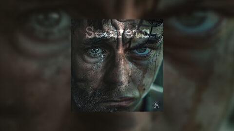
This portfolio design artwork highlights the commercial digital layout and graphic architecture for Stone Alibi’s "Secrets" music release. The objective was to design a highly atmospheric, intense and emotionally raw single cover that captures a dark, cinematic aesthetic. The layout instantly communicates a moody electronic, alternative rock and dramatic indie sound, deep psychological storytelling and a striking product identity optimised for digital streaming platforms and social media distribution.
Design & Requirements Breakdown
Visual Symbolism - The design features an ultra close up, gritty portrait of a man's face, marked by sweat, grime and a single tear, serving as the core visual narrative. The piercing intensity of the eyes one cast in shadow and the other illuminated with a cold, striking blue grounds the music in themes of vulnerability, internal conflict and hidden truths. This evocative, cinematic focal imagery seamlessly reinforces a sense of raw realism, high stakes drama and an intimate, deeply immersive songwriting journey.
Typographic Architecture - The layout incorporates a subtle, textually integrated typography system positioned in the upper left quadrant to manage the releases identity. The single title "Secrets" is rendered in a distressed, textured white sans-serif typeface that partially blends into the background imagery, mimicking a faded stencil or weathered overlay. A minimalist white vector logo/monogram sits cleanly in the bottom right corner. This deliberate layout decision ensures that the text does not distract from the raw emotion of the central portrait while maintaining a clear information hierarchy optimised for small digital streaming thumbnails.
Premium Presentation - The promotional artwork is presented in a high fidelity digital preview composition, framing the square single cover art precisely against a heavily motion blurred and scaled up extension of the central portrait's eyes. This focused presentation highlights the sharp visual resolution, the extreme facial textures and the clean square boundary lines of the artwork. By eliminating harsh borders, the composition offers a highly immersive, tactical and professional preview of a completed commercial music release ready for digital audio distribution.
Strategic Colour Choice - A sophisticated, de-saturated palette of deep shadow blacks, muddy browns, and cool slate greys forms the primary photographic canvas, evoking a harsh, gritty atmosphere. This muted foundation is powerfully enlivened by the cold, icy blue tone localised within the figure's eye, which draws immediate psychological focus. Balanced by the gritty white tones of the typography, this distinct colour configuration injects an immediate sense of tension, balancing raw cinematic grit with a polished, contemporary visual tone that easily stands out across competitive digital storefronts.
Target Audience Focus - The structured, concept first layout is meticulously tailored to engage fans of alternative, cinematic and dark indie music looking for deep emotional textures, music collectors seeking polished digital releases and retail music consumers demanding a transparent, highly professional package design that beautifully honours a raw, powerful single release.