
Riderr Product Catalogue Design
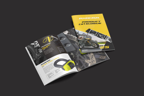
This portfolio artwork layout highlights the high octane art direction and rugged, precision focused layout architecture designed for the Riderr Product Catalogue. The design objective was to build an authoritative, high impact print and digital brochure that communicates industrial strength, reliable vehicle protection and premium engineering. The visual strategy relies on an aggressive, editorial grid system that seamlessly balances dynamic on road motorcycle photography with crisp, isolated product renderings, ensuring a professional presentation that commands attention across retail showrooms and Business to Business distributor meetings.
Design & Requirements Breakdown
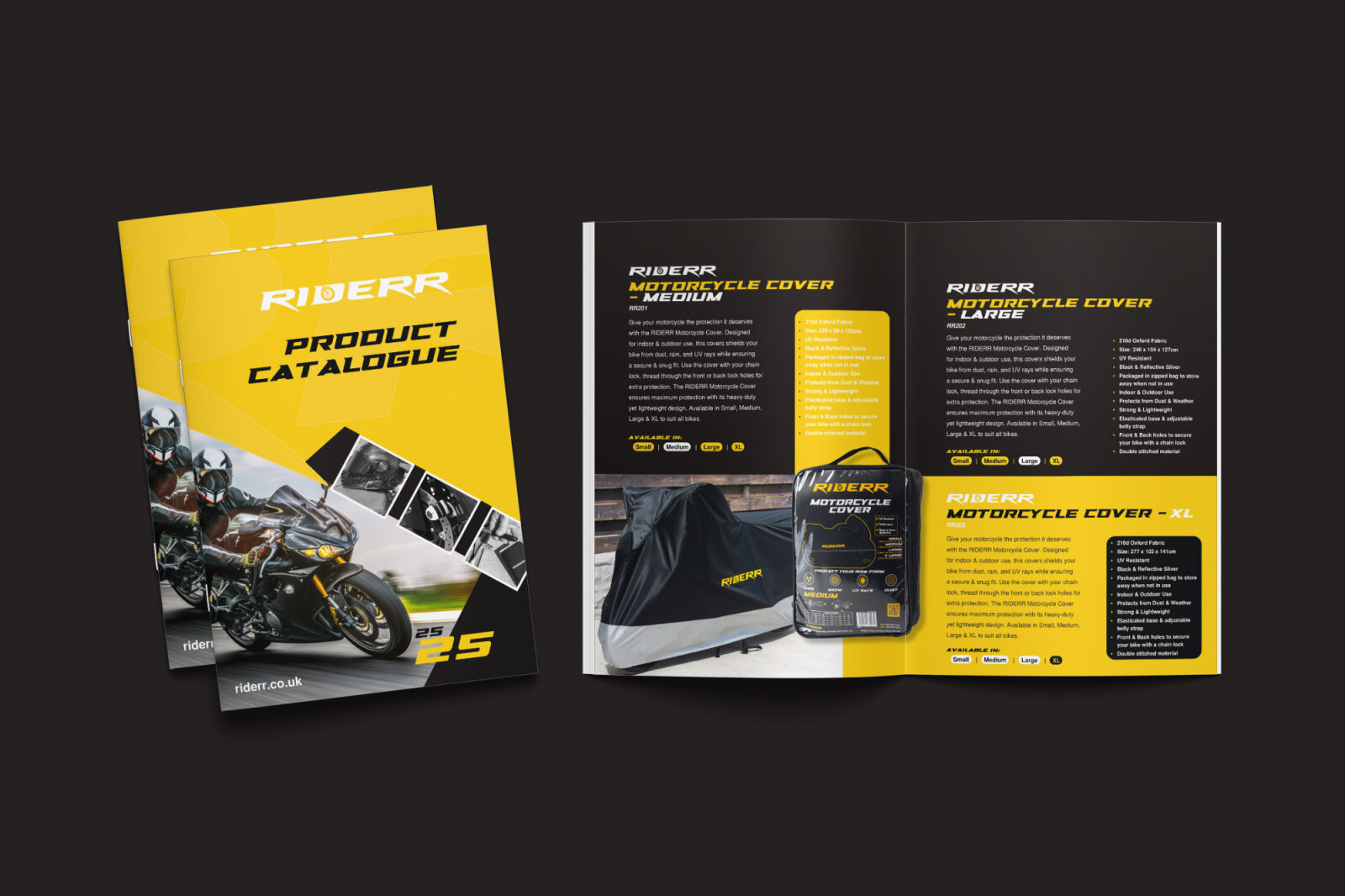
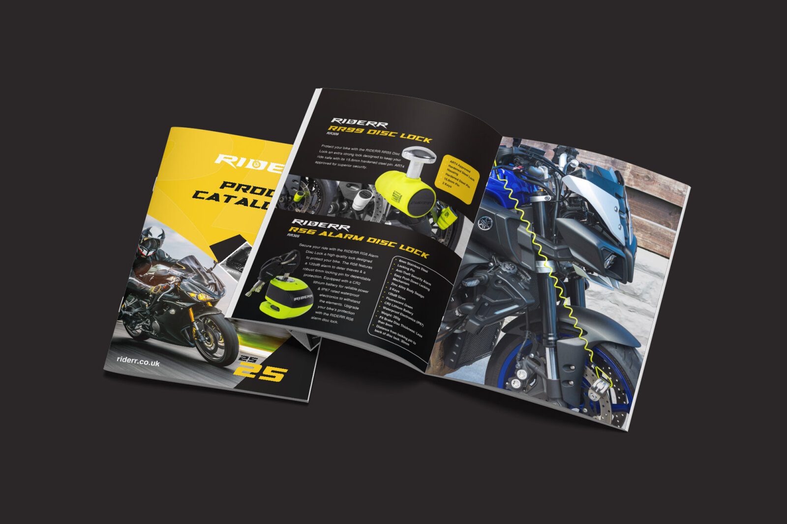
Visual Symbolism – The cover layout features an angled, high-velocity geometric color split that slices across the composition to frame action-packed imagery of sports motorcycles in motion. This sharp, directional design language mirrors the sleek lines of modern automotive styling, symbolizing speed, security, and forward-looking engineering innovation, beautifully showcased against an expansive, neutral charcoal backdrop.
Typographic Architecture – An aggressive, extended sans serif display typeface gives the master brand name "RIDERR" and the title "PRODUCT CATALOGUE" a powerful, heavy duty identity. On the interior spreads, the typography shifts to a highly organised layout, using bold white headers on black backgrounds for individual categories like "HELMET LOCK" and a vibrant neon yellow script accent for the "SUPER LONG U LOCK," perfectly paired with clean data grids to guarantee instant technical readability.
Premium Presentation – The multi-page brochure is displayed in a premium, high fidelity print mock up showing both the closed front cover and an open interior layout. This arrangement demonstrates the seamless visual continuity of the user journey, emphasising how the dark, immersive aesthetic of the cover flows naturally into clean, white framed product specification zones featuring high resolution 3D renders of the security hardware.
Strategic Colour Choice – The colour palette relies on an ultra modern, high contrast scheme of deep charcoals, stark whites and an intense, high visibility neon yellow. By anchoring the catalog in a deep tech black base, the neon yellow accents serve as functional visual cues that draw immediate focus to key security features, pricing and product dimensions, injecting an energetic racing culture identity into a heavy duty safety brand.
Target Audience Focus – The structured, performance first layout is meticulously tailored to engage motorcycle enthusiasts, automotive retail buyers and distribution partners looking for top tier security merchandise. It targets discerning consumers demanding an authentic, premium design that honours mechanical durability and advanced anti-theft design while maintaining a clear and highly intuitive purchasing path.