
Razor Wire by Heather Little Single Cover Design
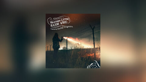
This portfolio showcase highlights the commercial layout and graphic architecture for Heather Little’s "Razor Wire" single release, featuring Stefan Prigmore. The objective was to design a highly cinematic, gritty, and emotionally intense single cover that captures a dark Americana, indie folk with a roots rock aesthetic. The layout instantly communicates a narrative of isolation, resilience, and raw storytelling, optimised for high impact presence on digital streaming platforms and physical distribution.
Design & Requirements Breakdown
Visual Symbolism - The design features a striking, atmospheric photograph of a figure standing alone at night next to a stark razor wire fence, casting a beam of light across a barren landscape. The harsh beam cutting through the darkness serves as the core visual narrative, symbolising a search for truth, hope, or perhaps escape amid restrictive barriers. This evocative focal imagery seamlessly reinforces themes of personal struggle, grit and the haunting, deeply honest songwriting characteristic of the single.
Typographic Architecture - The layout incorporates a distinctive, hand drawn typography system positioned in the upper left quadrant to manage the single's identity. The artist's name "HEATHER LITTLE" and track title "RAZOR WIRE" are nestled within a custom, flowing filigree frame that matches the artist's established visual branding. Directly below, the guest feature text "Featuring Stefan Prigmore" is rendered in an elegant, legible script. This deliberate placement ensures strong identity recognition while leaving the dramatic central photographic action unobstructed.
Premium Presentation - The promotional artwork is presented in a high fidelity digital preview composition, framing the square single cover art precisely against a heavily blurred and warm studio vignette backdrop. This backdrop mirrors the out of focus, cinematic lens flare and amber tones of the central photograph. This focused layout highlights the exceptional colour grading, the sharp textural details of the landscape and the clean boundary lines of the artwork, offering a polished preview ready for global streaming platforms or promotional campaigns.
Strategic Colour Choice - A moody, high contrast palette of deep night sky blues, shadows, and industrial greys forms the foundational canvas, establishing an immediate sense of tension. This cold atmosphere is powerfully cut by the brilliant amber, orange, and warm white tones of the flashlight beam illuminating the dry grass and fence. This distinct colour configuration injects an immediate sense of drama and cinematic depth, ensuring the artwork catches the eye even as a small thumbnail on crowded digital storefronts.
Target Audience Focus - The structured, narrative first layout is meticulously tailored to engage fans of modern folk, alternative country and storytelling singer songwriters looking for deep thematic music, vinyl and CD collectors seeking premium artistic packaging and music consumers demanding a raw, highly professional package design that beautifully honors a powerful and evocative acoustic single release.