
Purple Cleaners Cleaning Services Flyer Design
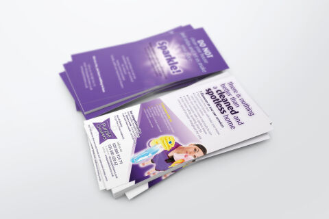
This portfolio showcase highlights the commercial print architecture and advertising layout for the Purple Cleaners Cleaning Services Flyer Design. The objective was to design a highly professional, clean, and inviting marketing flyer that bridges professional domestic authority with clear, informative graphic design, instantly communicating service precision, household care reliability, and structured business communication.


Design & Requirements Breakdown
Visual Symbolism – The design features a cheerful character illustration of a domestic cleaner equipped with essential spray products, anchoring the central visual layout. This pristine theme is beautifully echoed via a prominent graphic flare effect illuminating the word "Sparkle!" on the reverse purple face, visually reinforcing deep, high standard sanitation results. Dynamic, sharp geometric purple angles cut across the white canvas margins, structurally framing the service information blocks while maintaining a clean, modern aesthetic.
Typographic Architecture – A clean, modern sans-serif headline blocks out the welcoming statement "there is nothing better than a cleaned and spotless home," utilising a high contrast dark indigo weight to emphasise premium results. On the lower left panel, the stylised "Purple Cleaners" banner emblem anchors vital contact information, balancing crisp phone coordinates and digital web links in a neat vertical block, while a bulleted layout neatly structures core service features to keep a lightweight information hierarchy optimised for effortless reading.
Premium Presentation – The promotional collateral is presented in a premium 3D print mock up perspective showcasing a two part stacked arrangement with a fanned pile of the white informative front side overlapping a stack of the solid purple promotional back face, resting on a soft grey studio backdrop. This composition emphasises mass print production quality, authentic edge definition and dual sided layout continuity, offering a highly tactile preview of a complete commercial marketing touch point.
Strategic Colour Choice – A sophisticated, professional palette of deep indigo purple, vibrant violet, and soft lavender forms the core brand signature backgrounds and geometric blocks, heavily contrasted by a crisp white writing canvas and high visibility yellow sponge accents within the graphic. This distinct, cohesive palette evokes immediate domestic trust, freshness logic and a clean, highly recognisable home service brand identity.
Target Audience Focus – The structured, care first layout is tailored to engage busy residential homeowners looking for elite domestic maintenance, commercial property landlords seeking a reliable end of tenancy deep clean partnership, and local residents demanding transparent, highly professional routine trade communication.