
Portrait by Stone Alibi - Music Single Design
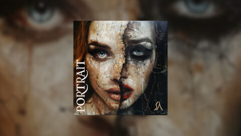
This portfolio artwork design highlights the commercial graphic layout and fine art art direction for Stone Alibi’s single release, "Portrait." The creative objective was to develop a haunting, dualistic and visually arresting cover design that embodies alternative rock, gothic metal with dark electronic genres. The final composition serves as a striking visual statement on fragmentation, inner conflict and hidden identities, optimised for maximum visibility across physical CD packaging and streaming storefronts.
Design & Requirements Breakdown
Visual Symbolism - The artwork features a split face female portrait divided by a jagged, vertical fracture line reminiscent of cracked porcelain or stone. The left side showcases a clear, classical beauty with bright, piercing blue eyes, while the right side morphs into a dark, shadowy and heavily distressed visage with smudged charcoal makeup. This stark contrast acts as a powerful visual metaphor for duality, exploring the tension between public persona and private trauma and sanity with emotional desolation whilst perfectly reinforcing the thematic weight of the single's title, "Portrait."
Typographic Architecture - The composition applies a highly deliberate, vertical type arrangement along the lower left edge. The track title "PORTRAIT" is rendered in an elegant, stylised serif font, utilising clean white lettering to achieve high contrast readability against the textured background. In the lower right corner, the artist's signature initials or logo emblem "SA" are placed in a muted gold script, ensuring brand recognition while maintaining an uncluttered canvas that lets the central face illustration remain the focal point.
Premium Presentation - The promotional asset is presented as a high fidelity digital media preview, embedding the square single artwork within a specialised studio presentation frame. The artwork is set against a heavily blurred backdrop that mirrors the intense, close up details of the woman's eyes and cracked skin texture. This out of focus background frame creates an expansive sense of depth, drawing the viewer's immediate focus to the sharp details, rich textures and boundaries of the core CD cover design.
Strategic Colour Choice - The colour palette relies on an evocative mix of earthy, de-saturated flesh tones, bone whites and deep charcoals, creating a cold, antique canvas texture. This muted environment is broken by the electric brilliance of the subject's blue irises and the rich, crimson red of the split lips. The high contrast between the dark, shadowy right side and the illuminated left side maximises dramatic tension, ensuring the design holds strong visual presence even when scaled down to a small thumbnail on digital screens.
Target Audience Focus - The sophisticated, narrative driven visual layout is purposefully engineered to capture the attention of alternative music enthusiasts, physical CD collectors who appreciate dark aesthetic art and modern music consumers looking for an evocative, professional design that successfully bridges fine art portraiture with contemporary audio branding.